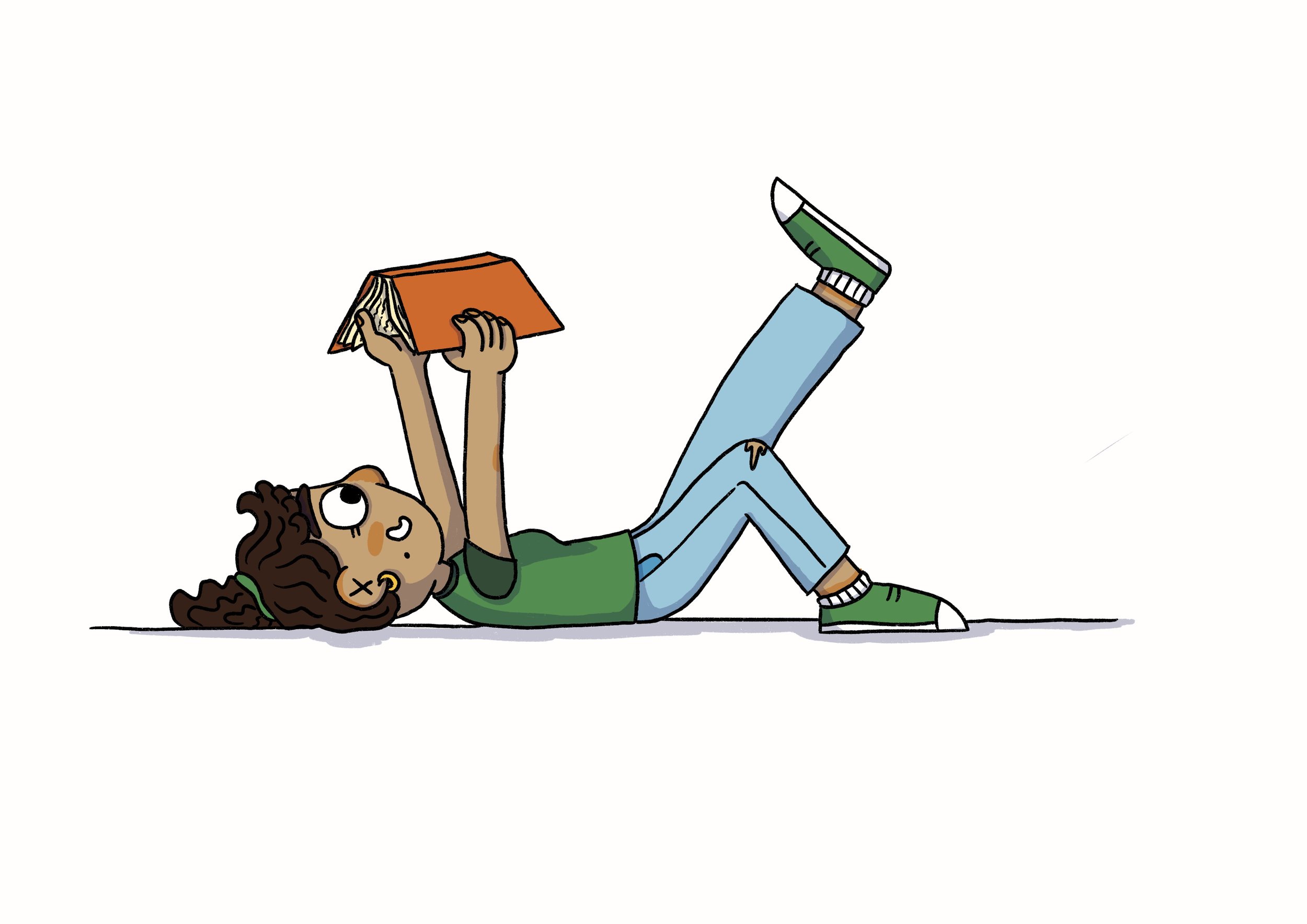
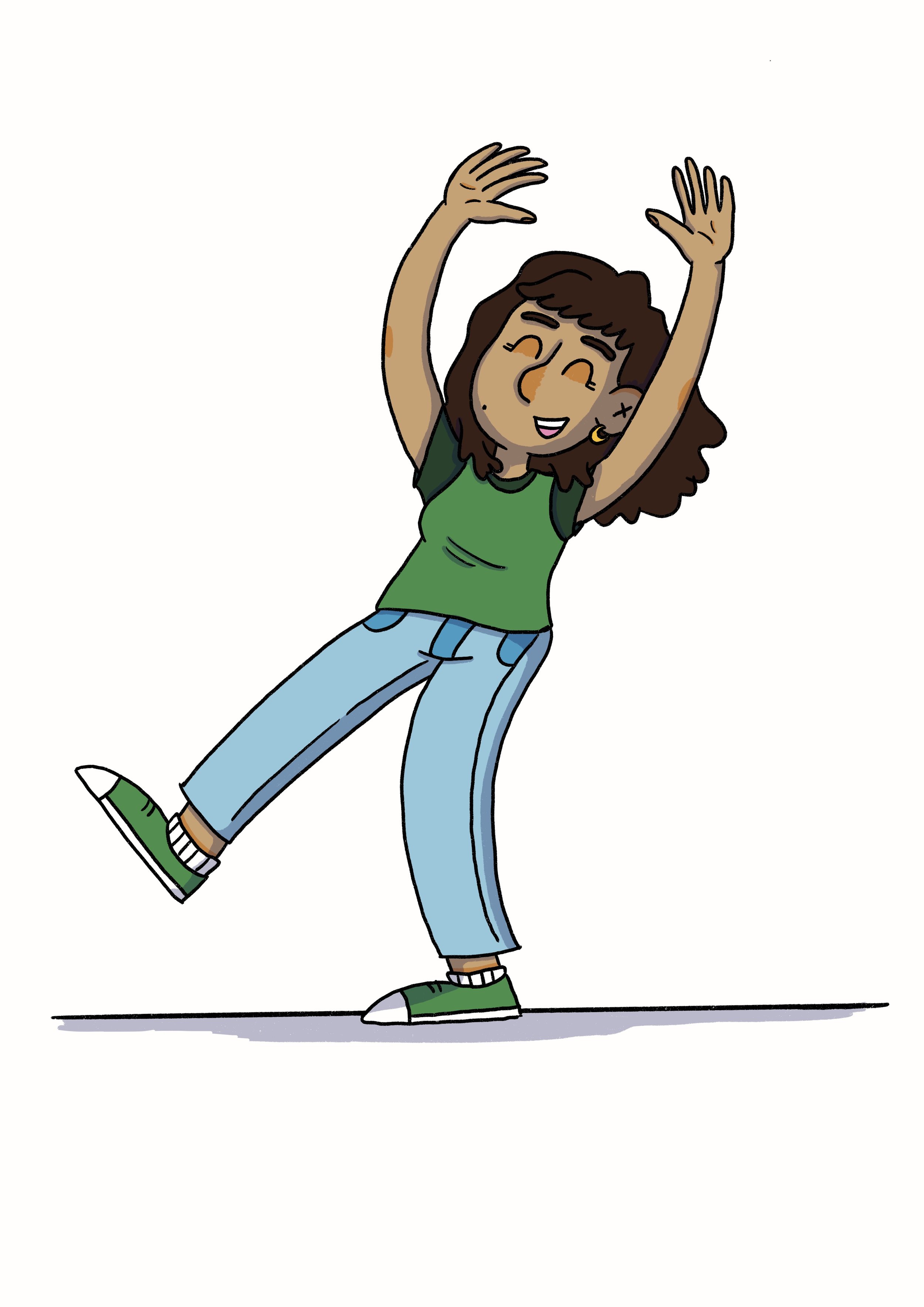
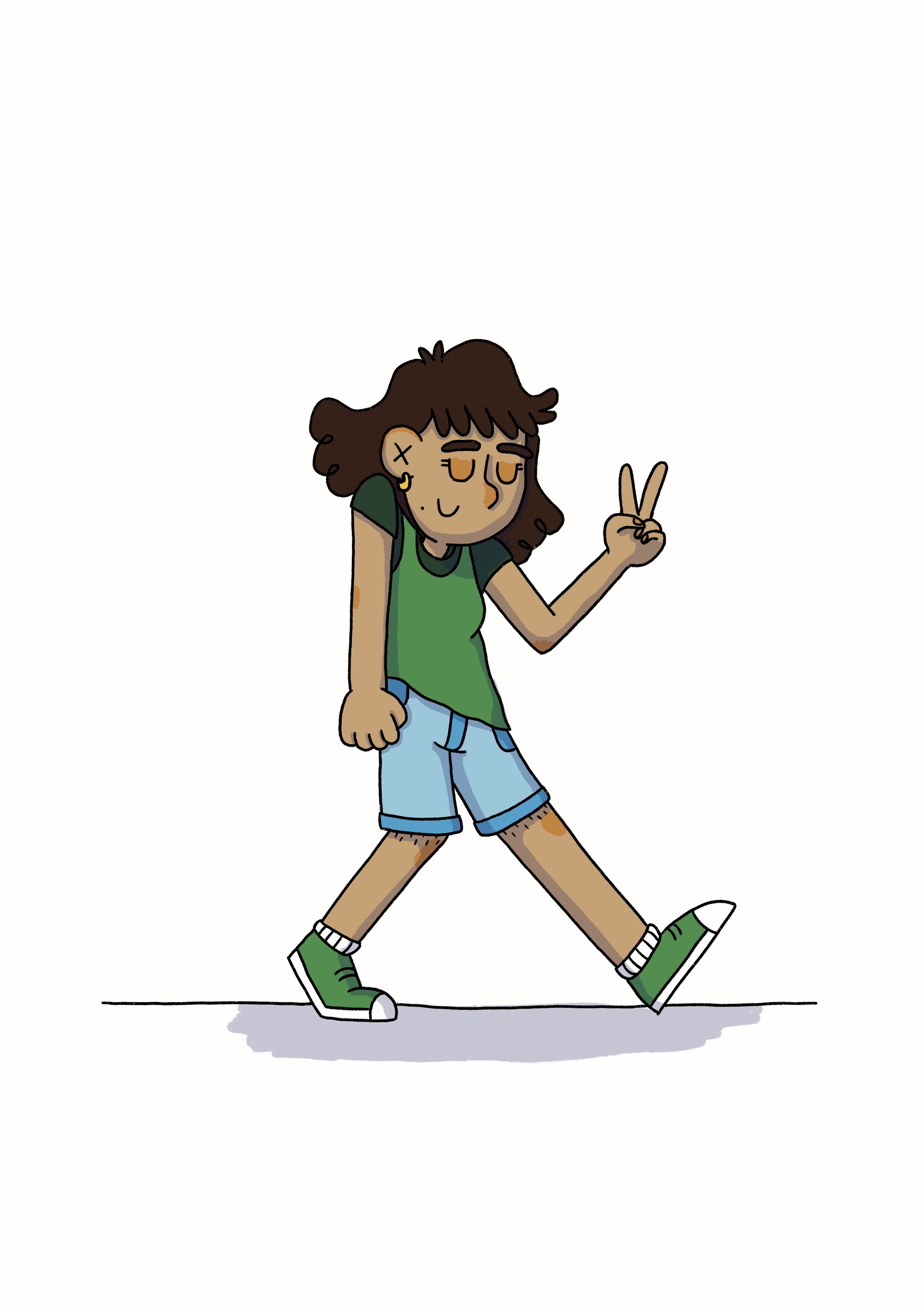
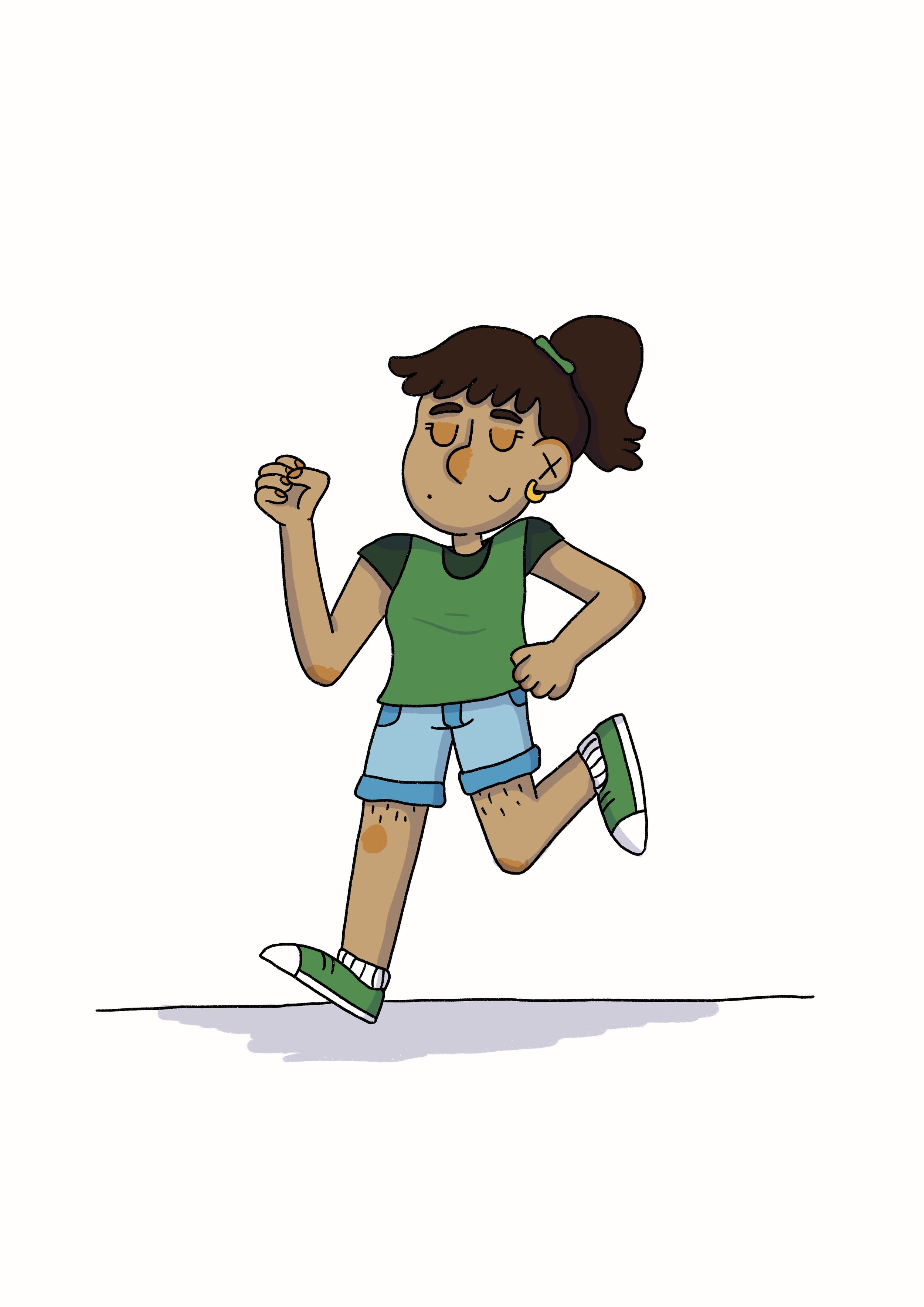
Oh Brother Preview Chapter


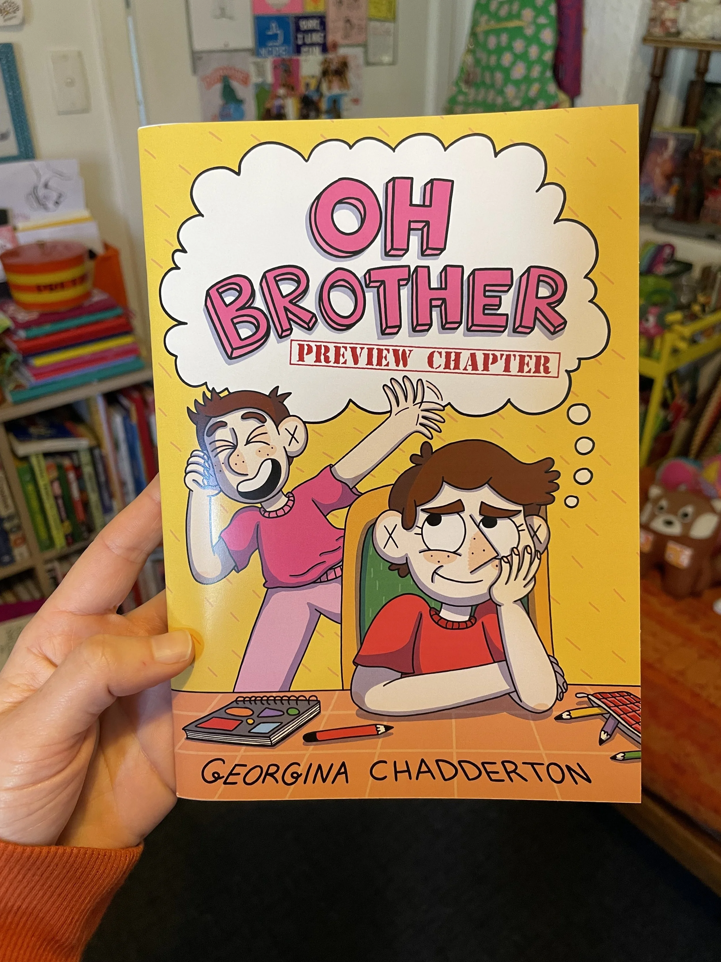
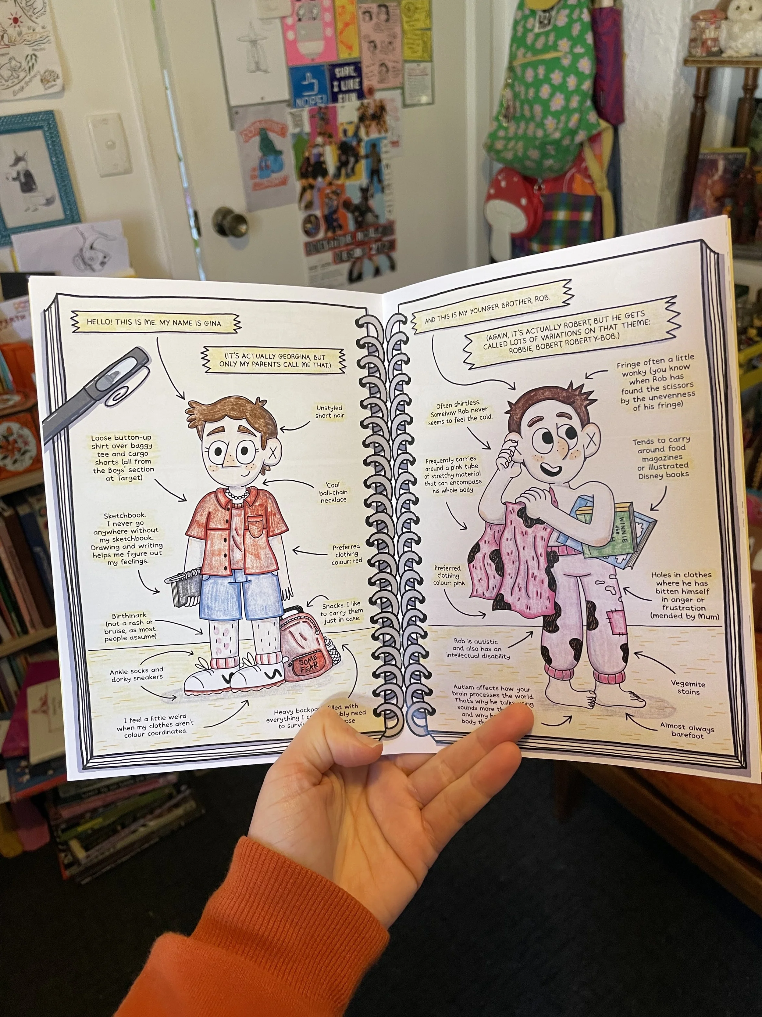
Gina holding a copy of the Oh Brother preview chapter.

Friends! Because I absolutely couldn’t wait until February to share at least some of the book with you, I’ve printed out limited editions of the first chapter of Oh Brother as a mini comic preview.

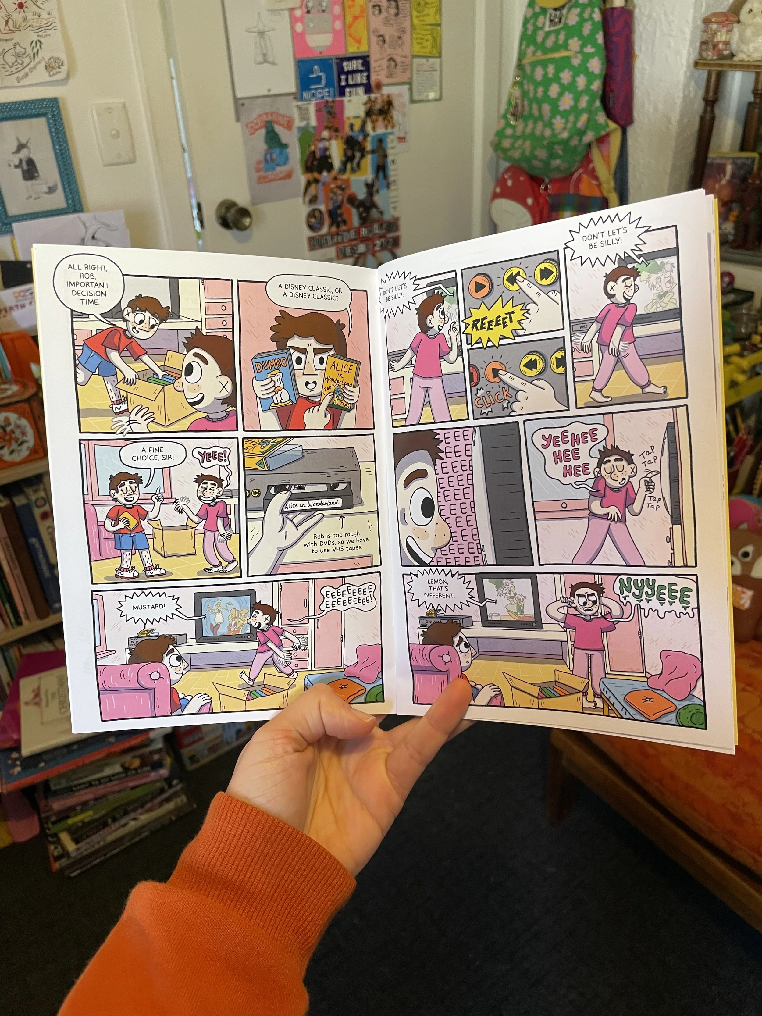
Gina holds open a comics spread from chapter one of Oh Brother.

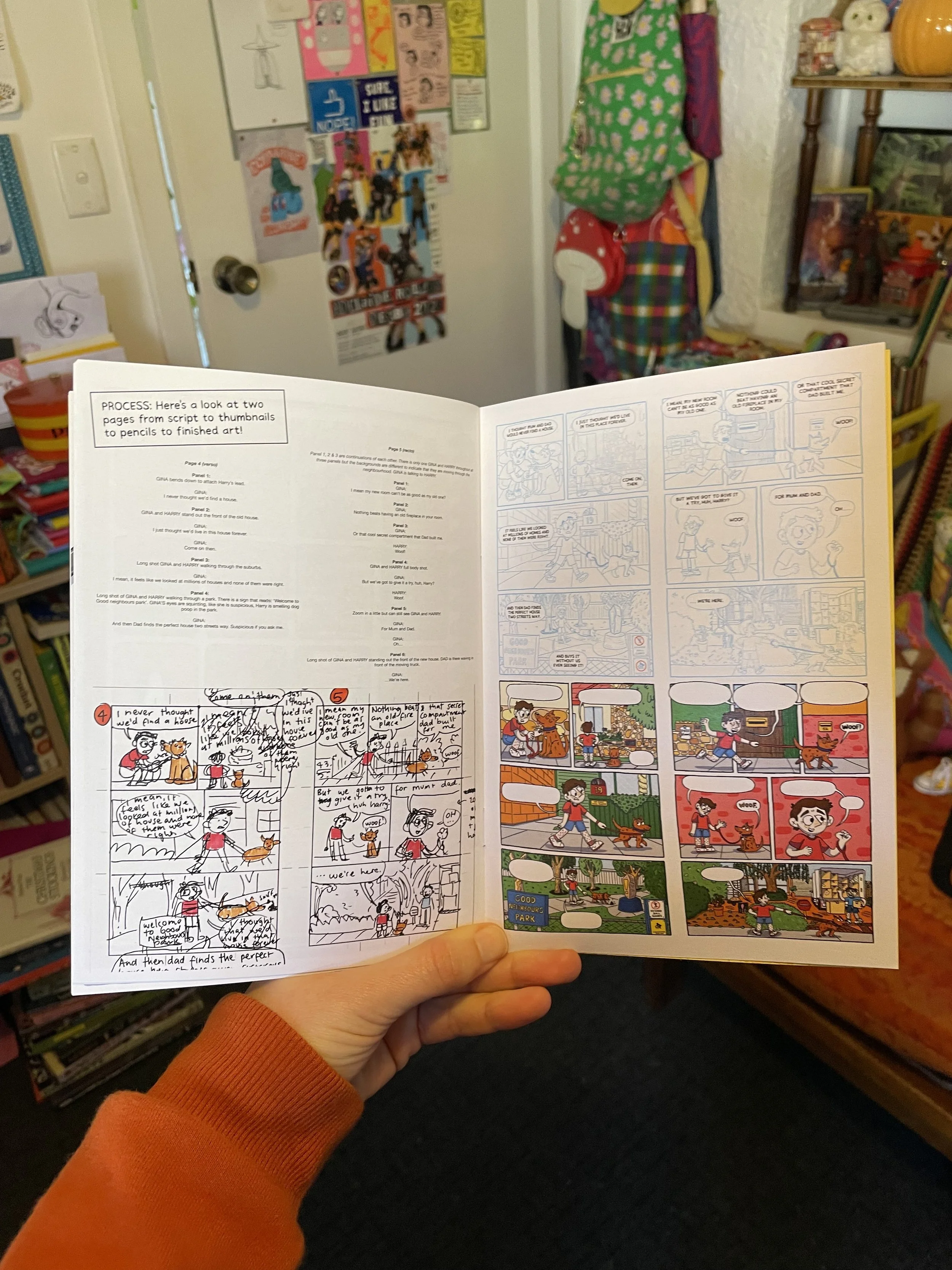
I’ve also added in a few ‘Behind-the-Scenes’ bonuses at the end of this mini comic (like my process from script to final art). These aren’t in the final book, they are just for the preview chapter.

Gina holds open a page of process images from script to final art.

Are you impatient like me and want to get your hands on your very own copy of these little babies? Pop over to my online shop to snaffle yourself a copy.

Gina holds open a double page spread that looks like it’s drawn in a sketchbook.

For folks in Adelaide (who don’t want to pay postage), I will have them available to buy on the day at the Papercuts Market Day in September. I’ve also dropped off a few copies to Greenlight Comics for their local section.

How to preorder Oh Brother


If you’re reading this, you’re already checking out my website, but if you’re after more specific Oh Brother info (preorders, sample pages, background on the book, etc.), hop over to the page all about Oh Brother.

Can’t wait for the final book? You can also buy a preview chapter of the book (including fun behind-the-scenes stuff that’s just for the preview chapter) here.

I hope you enjoyed this silly little “how to” comic. :-)

Oh Brother preorders are now live!


Title page from my upcoming graphic novel memoir, “Oh Brother”. A cartoon of three kids stand on a wooden floor under the book title.

Hello pals!
I’ve been hiding away in the studio finalising all things Oh Brother and I’m VERY EXCITED to be crawling out from my comics cave to announce that you can now PREORDER your very own copy of my book! Eeeep!

Publication date is still not until 10 February 2026 but preorders are great for authors, as it can show the publisher and bookstores that folks are keen for the book. 

You can preorder online (here for Australia and here for the US) but I highly recommend supporting your local bookstore or comic shop (having worked in both bookstores and comic shops). You can contact your local now and order a copy using the ISBN: 9781761046346

I know comics are expensive, so another great way to support the book is to request that your public library orders in a copy of the book (which also means that lots of other people can have access to the book too!). 

It's starting to feel really real now. I feel almost as cool as a sun wearing sunglasses (which, as we know, is the ultimate symbol of coolness). 

Comics Cave Continues


A cartoon panel of two people standing on a beach, one with long wavy hair and wearing a stripy orange shirt shaking the other person who has short brown hair and wearing a baggy red button up shirt. The person in the orange top is saying “Ahh, nonsesne, you’re great at drawing!

I’m crawling out from my comics hermit cave to share a panel from a recently finished page of my upcoming graphic novel, Oh Brother.

The deadlines have been crunchy, so I’ve going to head back to the cave now. But I’m hoping to pop in over the next few weeks and share a few snippets of the book when I can. I’m excited about how the colours are looking and can’t wait to share more with you all!

Sign up for my newsletter


Cartoon Gina leaning sideways on the kitchen bench asking “What should I do now?”

I’m deep in the inking of the book at the moment (although I had to colour a few pages to make sure I’d set my files up correctly - which is where this panel comes from). It’s exciting to finally get to the stage of the book where I can start really seeing the final work coming together.

But because my deadlines are really tight, I’m going to be pretty absent from the world (both online and in real life) for the next four months. However, I will be sending out a few newsletters over that time with updates and sneak peeks at pages I’ve been working on. So make sure you sign up to my newsletter to keep to keep up to date with my book-based shenanigans.
Pencils Complete!


A blue line drawing of a slice of Vegemite toast on a plate and a bite taken out of the corner of it. ‘The End’ is written in the Vegemite.

In very exciting news, I’ve just finished and sent in the pencils for the final chapter of my graphic novel, Oh Brother! This is by no means the end of the hard work (I’ve still got take on final edits and then ink & colour the book!) but it’s a huge step along the way to finishing and publishing my first graphic novel.

Because the book deadlines are super tight, I’m not going to be able to post too much here for next few months. So if you want to keep up to date with what I’m up to (and see more sneak peeks of the book), sign up to my newsletter (link in bio). I send out a little update at the end of each month with some behind the scenes looks at my work and links to any upcoming events I’m doing (pssst, I’m sending out my next newsletter tomorrow).

Alright, I’m going to go nap for a bit now so I’m refreshed and ready to start inking next week! 💪

Oh Brother Prep work, Part 3: Pushing Poses


A cartoon character holding up the peace sign with their fingers, leaning back on one bent leg and straightening out the other leg.

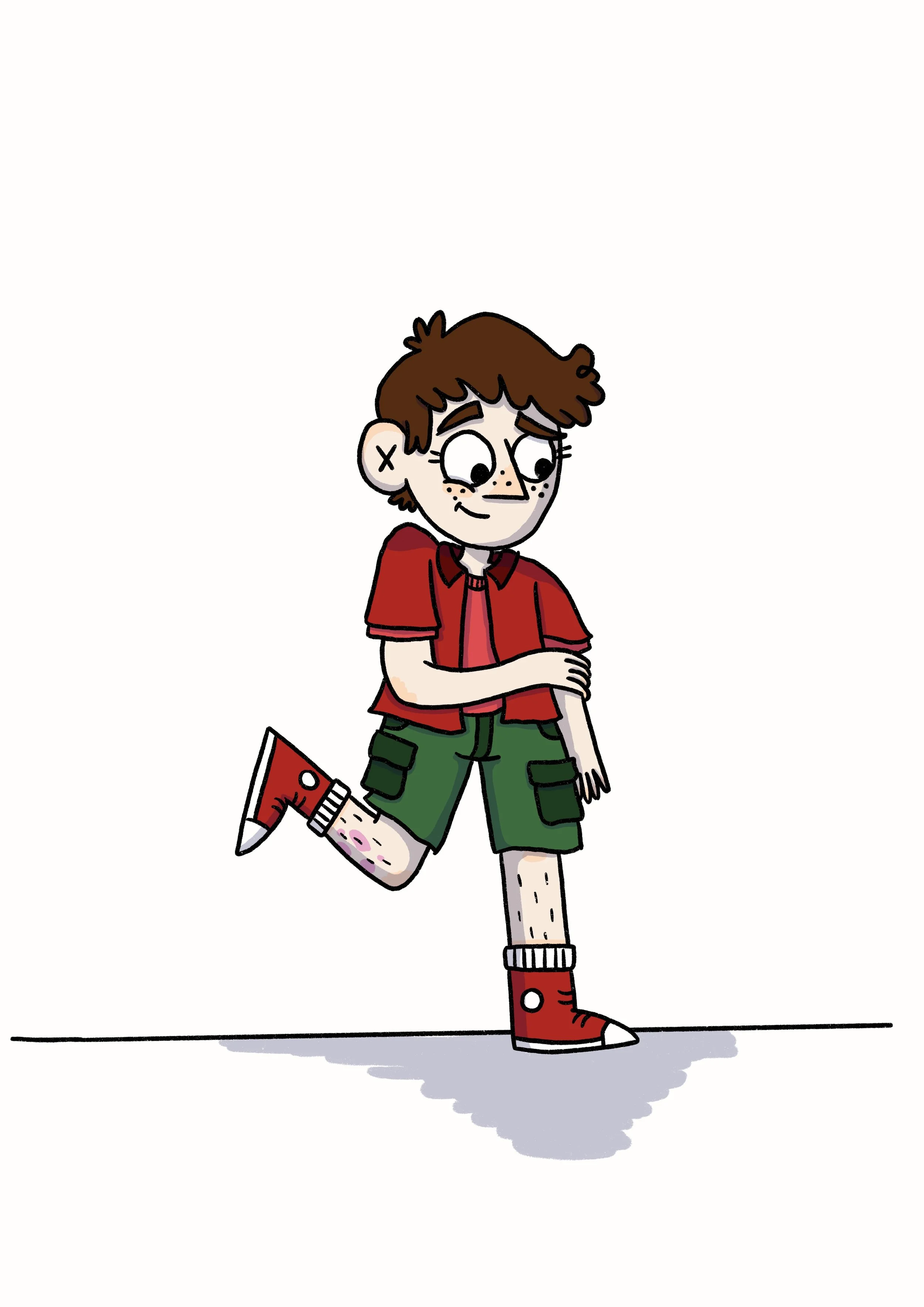
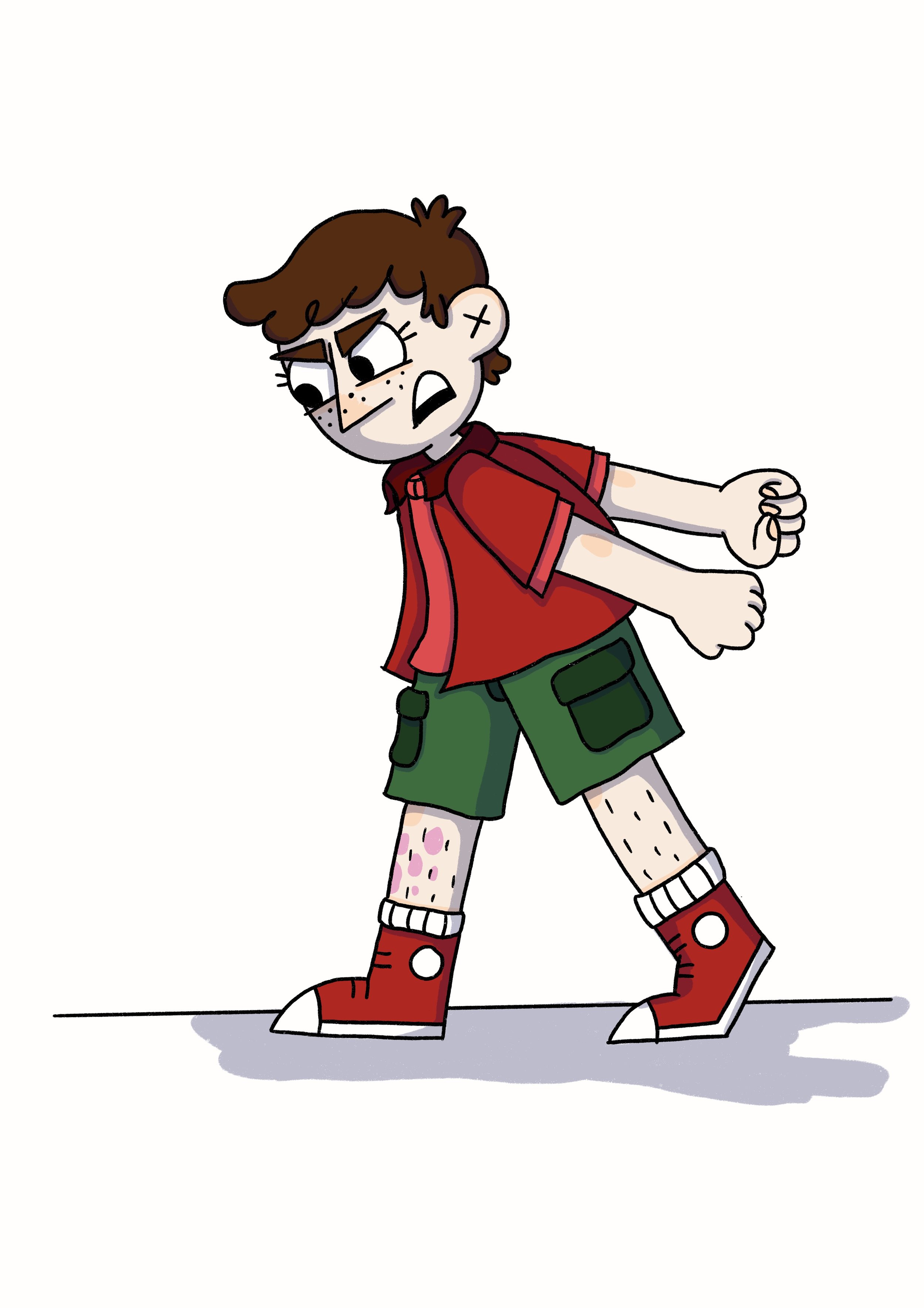
Following on from my previous posts about designing my characters and then practicing drawing their emotions, I had one final task: to practice drawing these characters in different poses!

My natural instinct is to draw all my characters in pretty much the same, boring, stock standard pose (standing straight with arms either hanging by their sides or in their pockets if I’m not feeling up to drawing hands). But after years of hanging out with animators, and seeing their excellently expressive and dynamically engaging character designs, something has finally started to rub off on me. I really wanted to be able to show more of the characters’ feelings through their body language (and not just their faces). So when I was practicing the new character designs for this rendition of Oh Brother, I tried my hand at pushing the poses of 5 main characters, starting with myself.

Gina - Pushing Poses

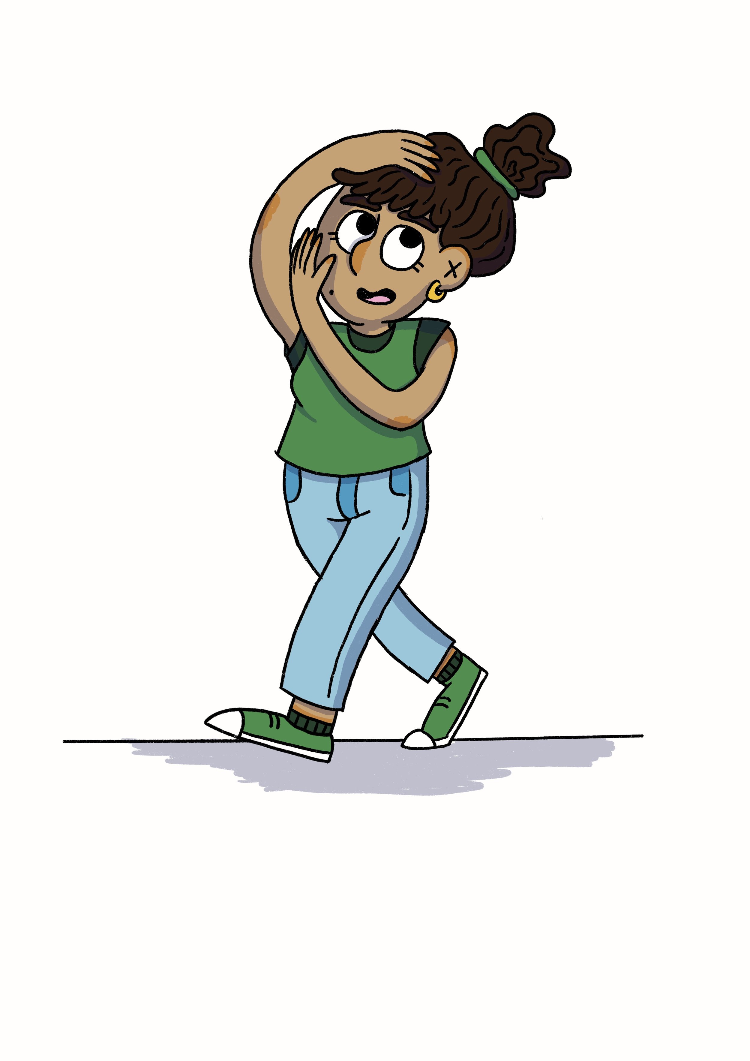
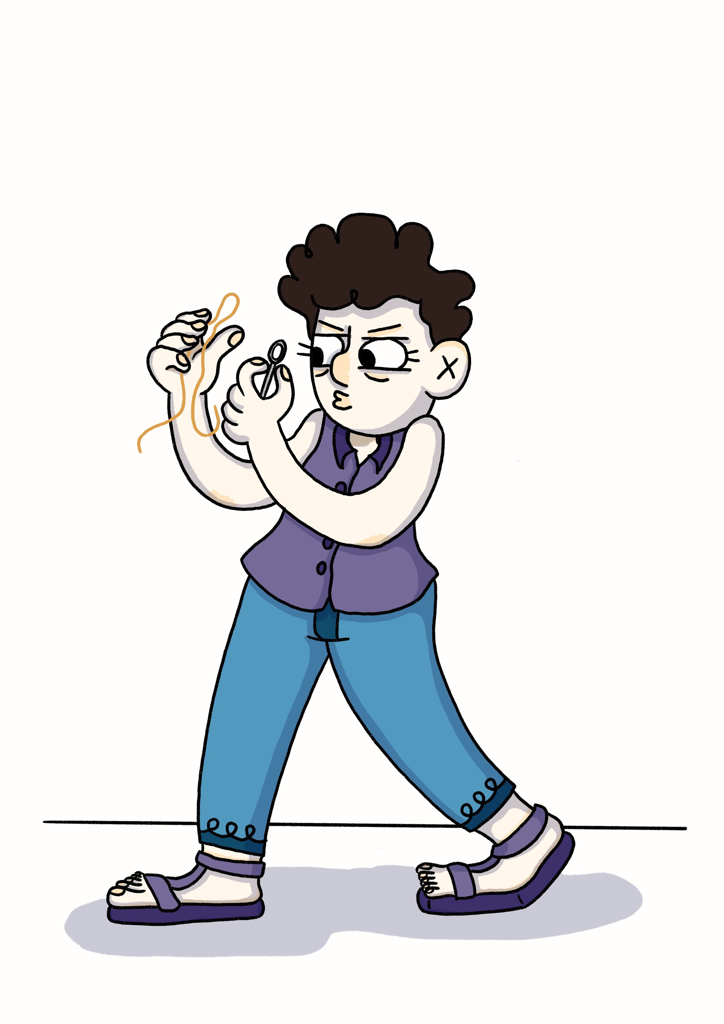
It was really hard for me to start pushing poses (as a naturally stiff pose drawer) but I loved seeing my characters become more loose and energetic the more I pushed the poses. I particularly enjoyed using this exaggerated body language to show the different personalities of the characters. My character’s poses are generally smaller and tighter as I’m a generally anxious and nervous human. In contrast, Callie’s poses (the friend character) are big and wide and open, because she is excited about lots of things and generally more open and welcoming.
CALLIE - PUSHING POSES

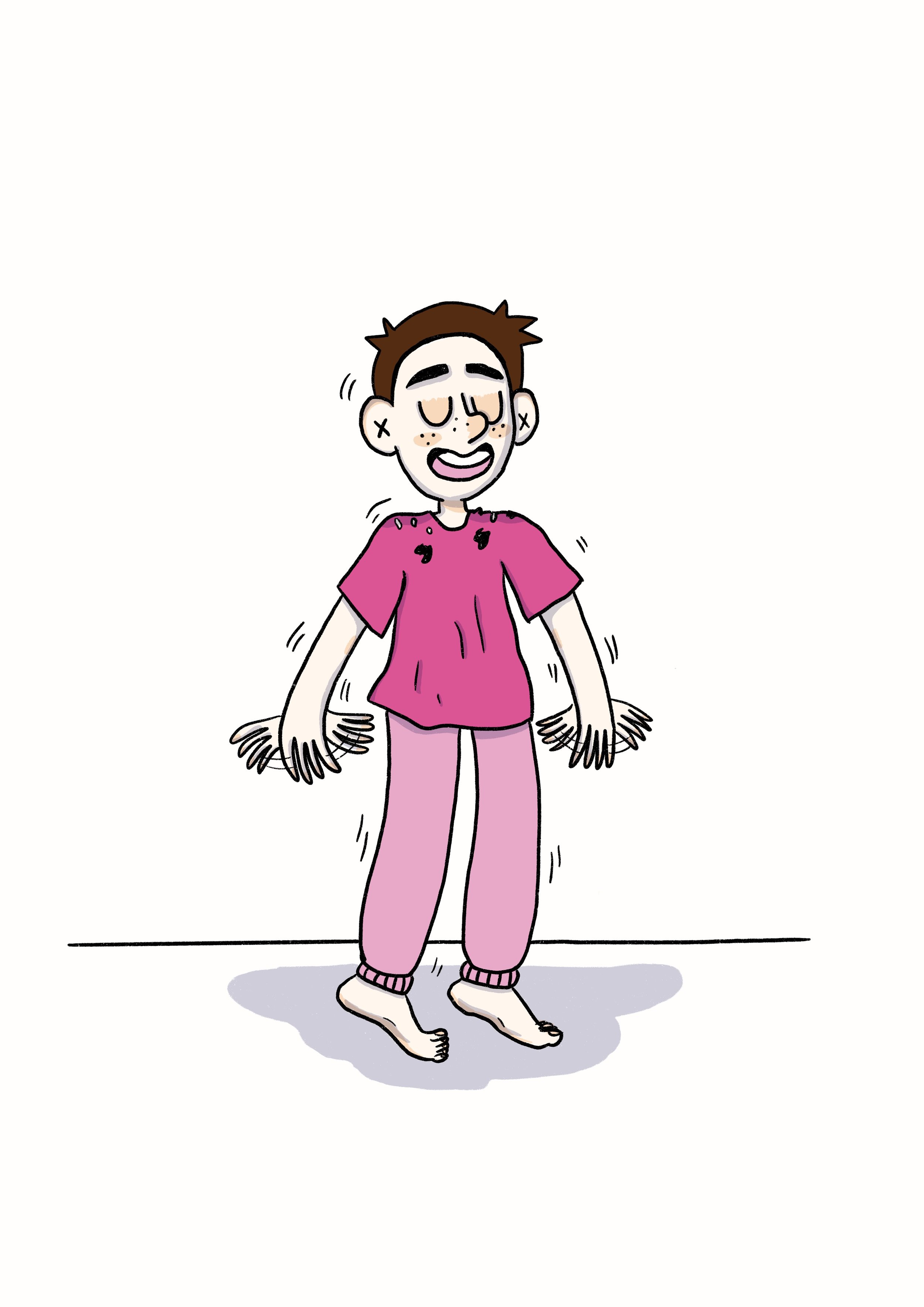
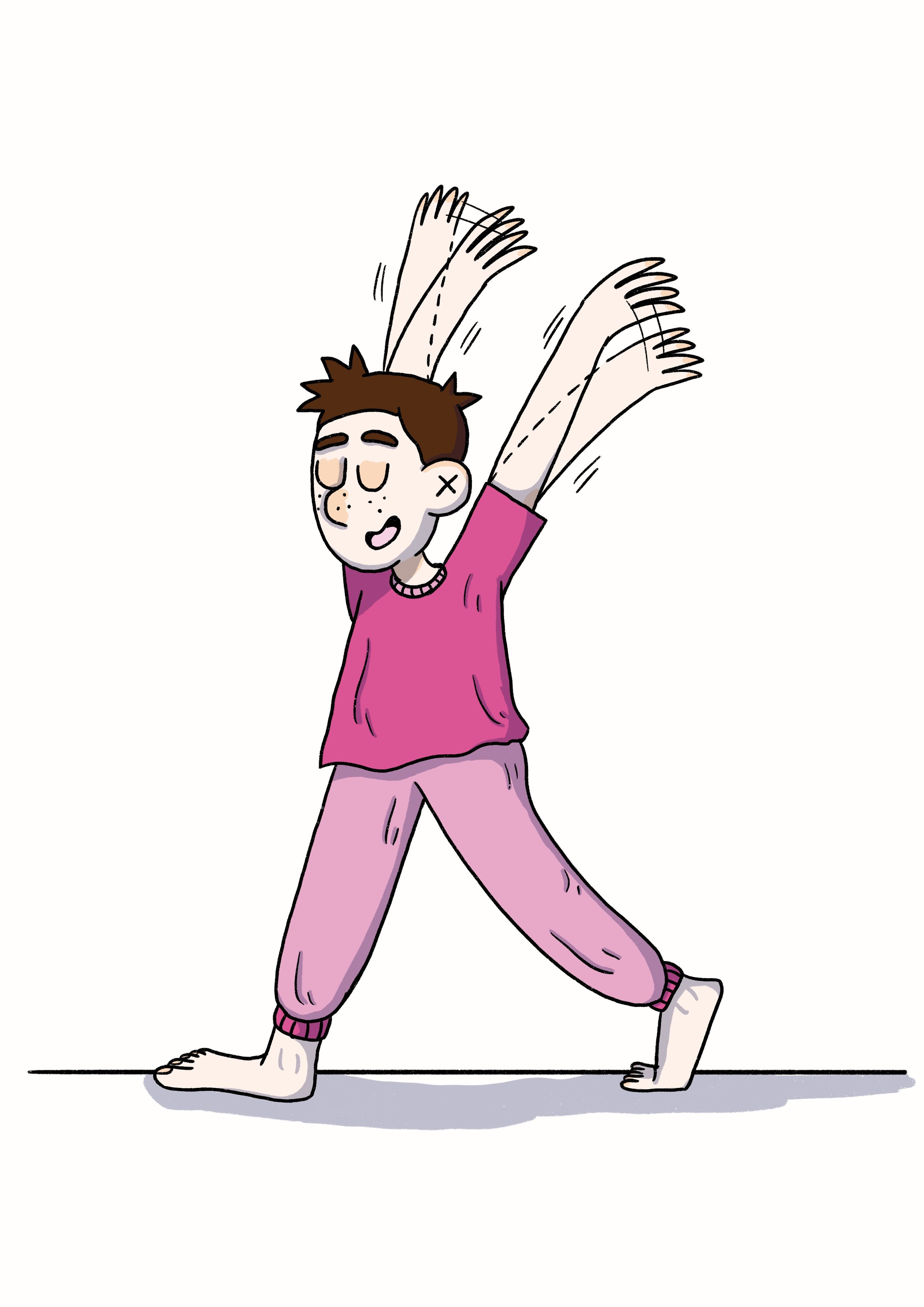
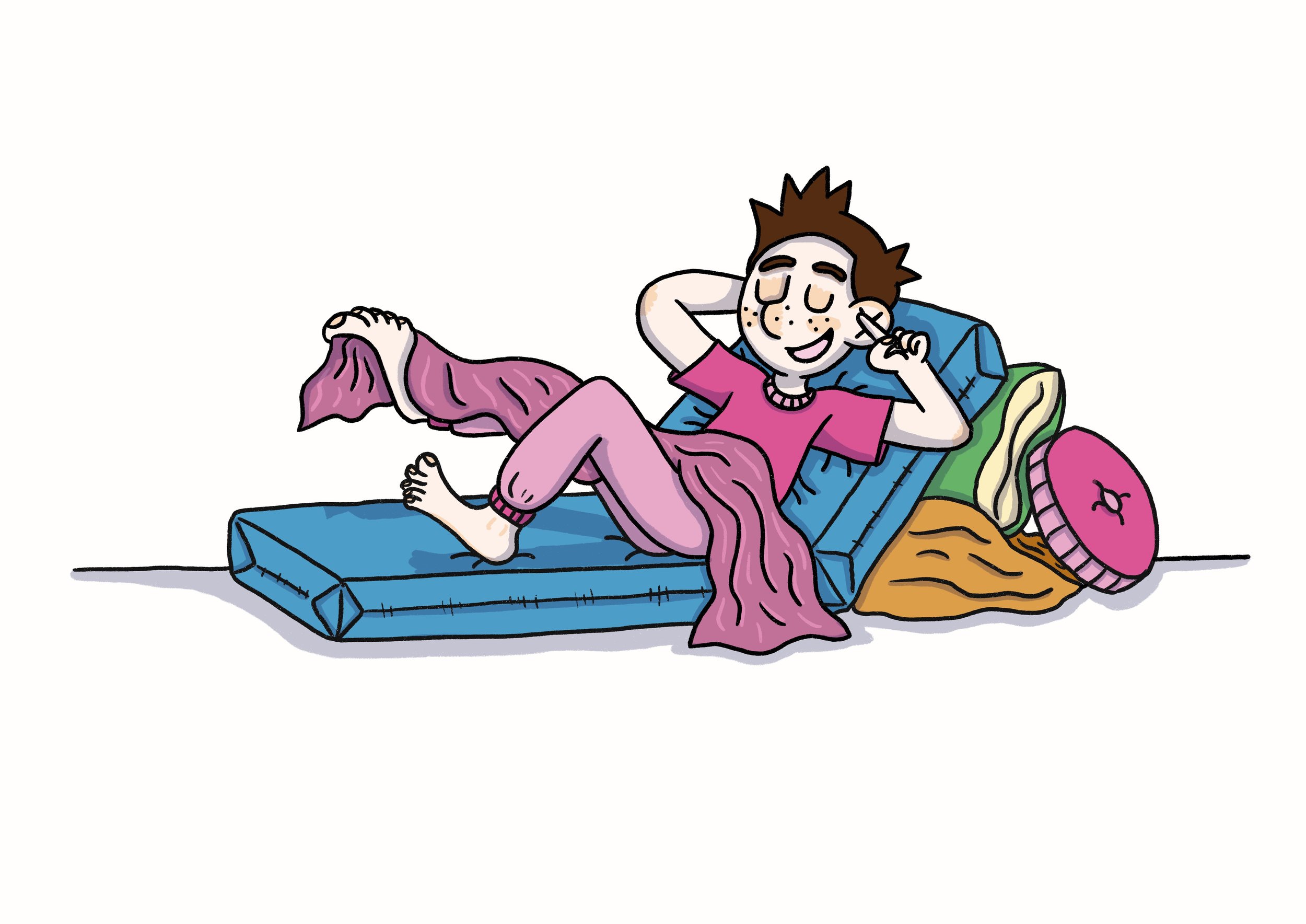
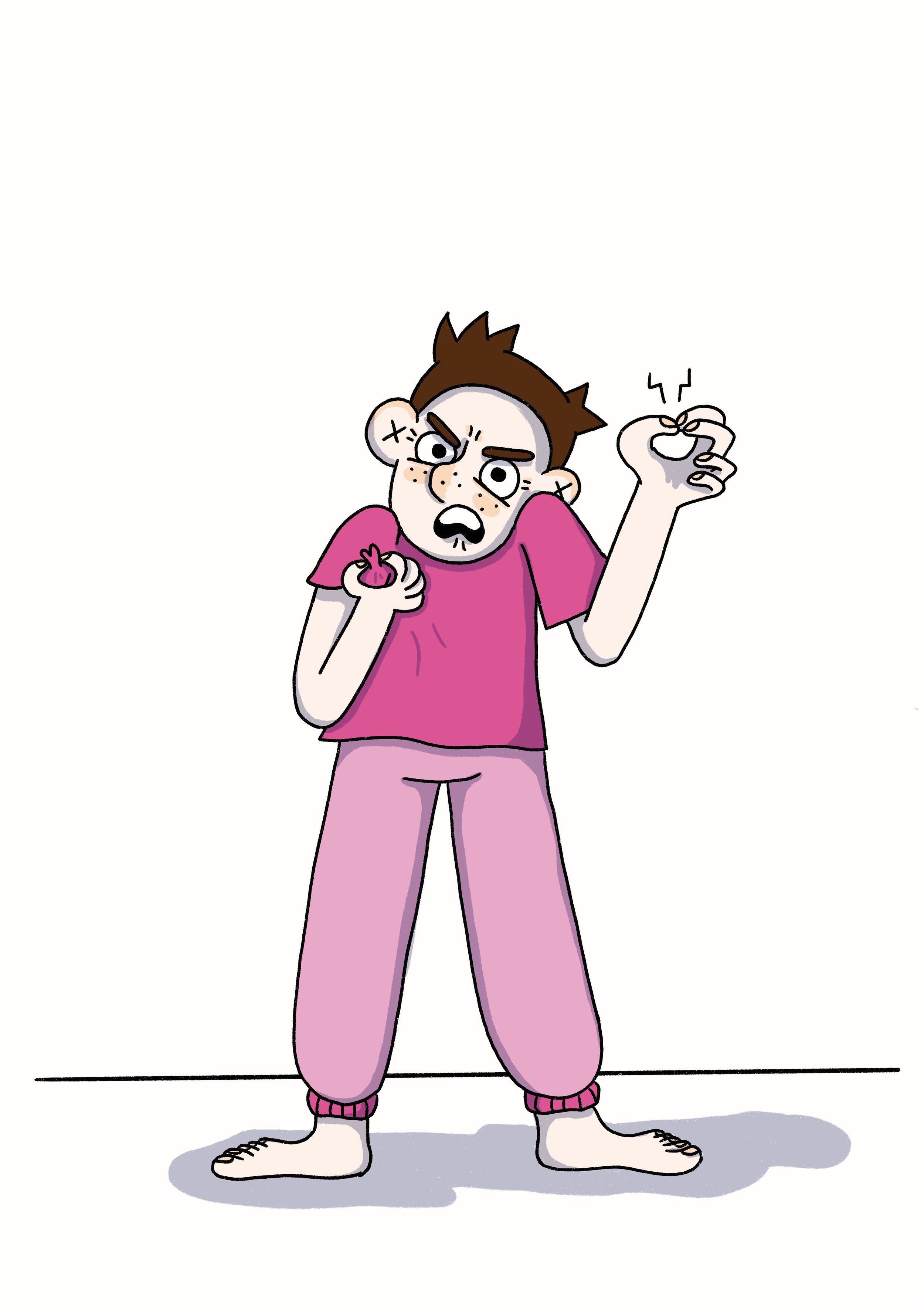
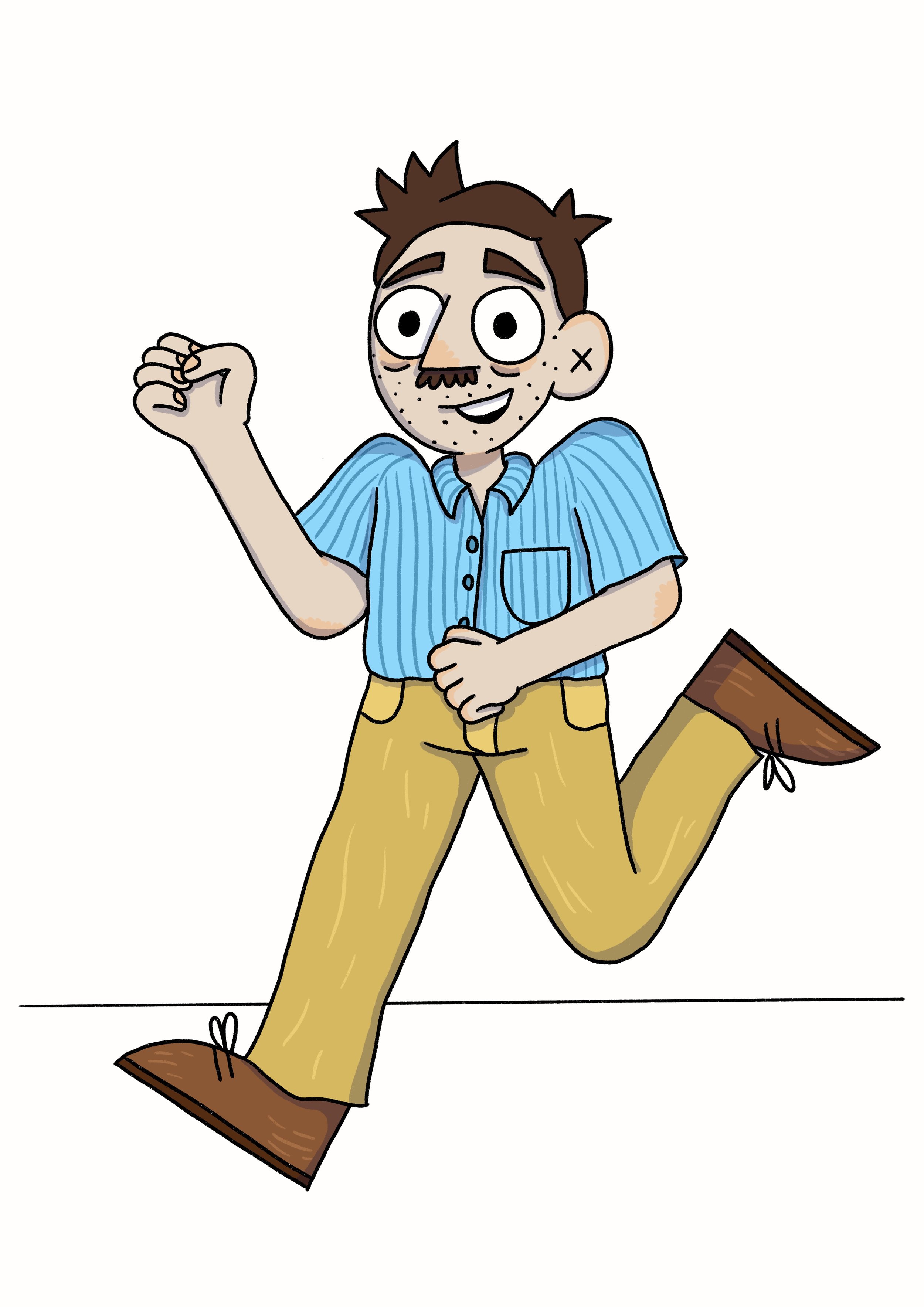
Pushing poses with my brother’s character had two extra drawing challenges: 1) He is constantly moving (whether it’s his arms or his legs, small movements and big movements, he never truly stops moving), and 2) He mostly went around barefoot when we were kids. I’ve done lots of playing around with ways to get across all of Rob’s different energies in the still image format of comics. And I’ve done my best to draw feet, which to me are like hands but much, much harder to draw (side note: I have never drawn so many feet in MY LIFE as I have with this book; I’d like to say that I’m getting better but…).

ROB - PUSHING POSES

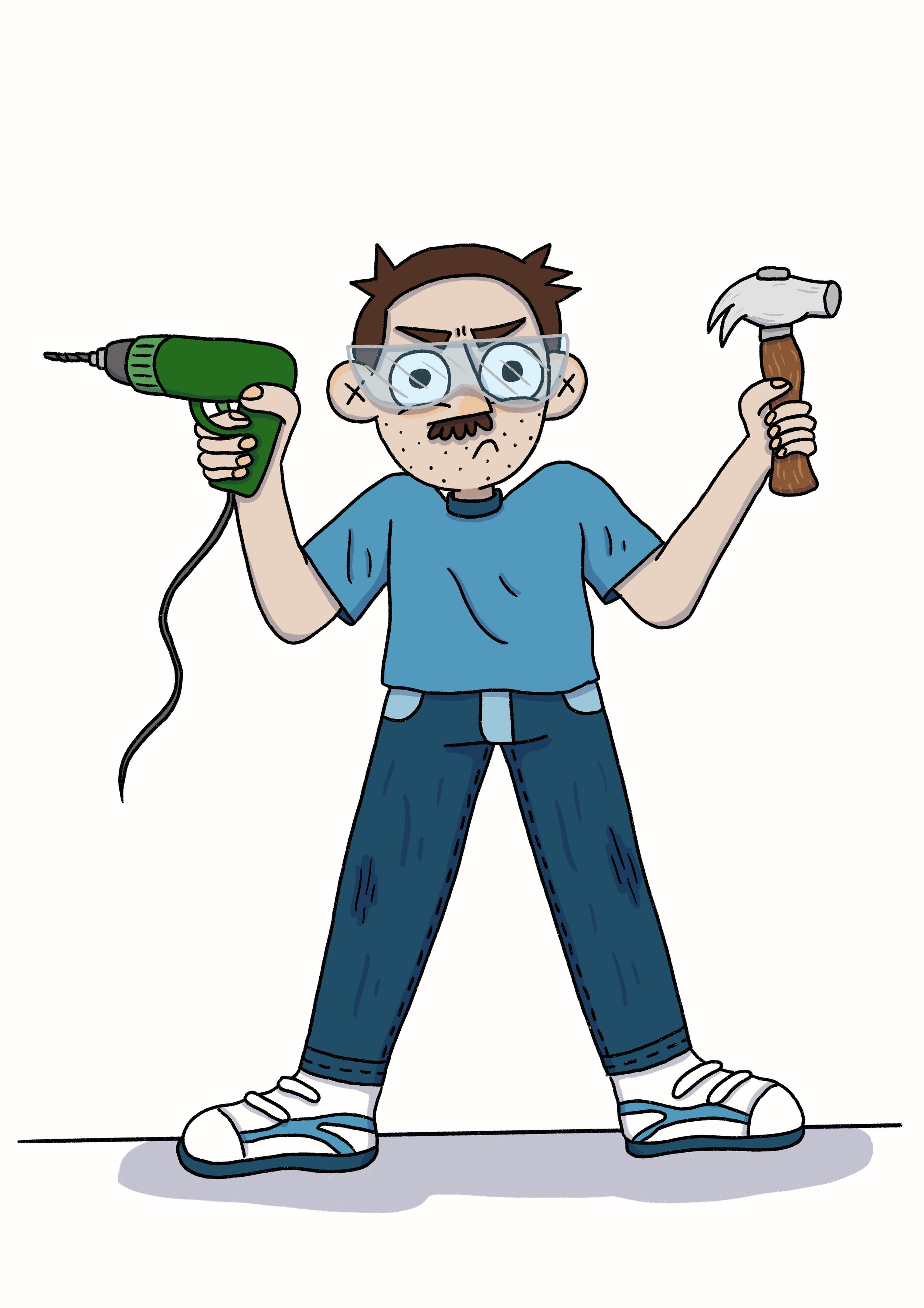
I think my absolute favourite pose, of all the characters, is the one of my Dad wearing safety goggles and holding a drill in one hand and a hammer in the other. He just looks so silly (which is a side I don’t think people expect when they first meet him) but also focused and business-like (which I think is more a personality trait that people do associate with him).

MUM & DAD - PUSHING POSES

A resource that a friend recommended to me that was super useful was Sherm Cohen’s SpongeBob Drawing tips. It was a good visual reminder about just how far you can push a pose.


As this was new to me and my perfectionism can get in the way of doing new things, I found that it was useful to follow these loose steps when trying to draw pushing poses:

  1. Pick a character.

  2. Decide on a pose.

  3. Pencil it, without worrying if I was pushing the pose “correctly”, just draw like I would normally draw.

  4. Then I’d pencil it again but I would actively think about how I could pull or stretch certain parts of the pose. Can I make an arm higher or a leg longer? Should the body be straight up or can I bend in more?

  5. Finally, the fun part: ink and colour!

Practicing all these poses really highlighted to me that when I exaggerate body language, the characters somehow look more real and the emotions I want to convey to the reader are easier for them to understand. This is what I love about comics! I can show in a drawing how I feel much more clearly than when I use words to try and describe how I feel.

I’ve already started to see the difference in my characters’ poses (both for this graphic novel and other shorter comics & character illustrations). So I will keep practicing this and hopefully it will slowly start feeling more natural to me and I’ll be able to cut out step 3.

Oh Brother Prep work, Part 2: Getting Emotional


Following on from my last post about how the designs of the characters in my graphic novel, Oh Brother, have changed over the 7-ish years I’ve been working on the book, this post is about my absolute favourite thing: drawing emotions!

Once I’d settled on the redesigns, I wanted to make sure that I could draw these characters experiencing lots of different emotions but still remaining recognisable, even when their faces were squashed or stretched out of their neutral positions. Drawing emotions is something I’ve always enjoyed doing for some reason, maybe it’s the power behind capturing feelings or emotions (which I can find pretty hard to describe with words but much easier to capture with drawings).

I love making an emotion chart for my characters as it really helps me practice keeping the character consistent (something that I think is important for easy reading in comics: you don’t want to be questioning which character is which while trying to enjoy a story). Making these charts also means that I’ve drawn the character’s heads at least 20 more times before I even start on the book (and each time I draw them, it helps me to really settle on their character design).

Here are the character emotion charts I made for the main Oh Brother characters when I first started working on the book (2016) and last year (2022) before I started working on the thumbnails.

2016

2022

Originally my character was older in the book, so I had longer hair. In the new version I have my beautiful early teen hairstyle (short, not-as-cool-as-I-wanted pixie cut).

2016

2022

Rob, although technically older in the original version too, didn’t change as much in design. Although, being younger, I gave him a softer, rounder face and nose.

2016

2022

Mum’s hair has and always will remain elusive for me. I don’t think I’ll ever be able to draw it accurately. I claim that it has a life of its own.

2016

2022

Dad’s design remains similar (he’s still got that sandpaper stubble) but because the book is now set when we were all younger, I was able to pay homage to what I thought of as my father’s most defining facial feature, his moustache (something that he had for most of my childhood but has now been without for much longer).

The only character who doesn’t have an emotion chart to compare is Callie, who is a new addition to this version of the book. Since doing this emotion chart for her and working on the pencils, I’ve decided to not give her a fringe (but I’ve kept pretty much everything else the same).

I’ve always enjoyed cartooning (in comics and animation) because you can really push how you draw emotions to clearly showcase how a character might be feeling or thinking. I find it much easier to connect to these more exaggerated characters. I’m also the kind of person who practices pulling faces in every mirror or any reflective surface that comes my way (often practicing how my smile looks - so I know what my face feels like when my smile looks right and I haven’t got mirror in front of me to check).

I love these little emotion charts; I find them super helpful to refer back to as I’m working on a project. I would recommend making them for your characters too (even if you’re not working on a big project and it’s just for fun). But be warned: you may find yourself pulling the faces you’re trying to draw!

Oh Brother Prep work, Part 1: Building Character


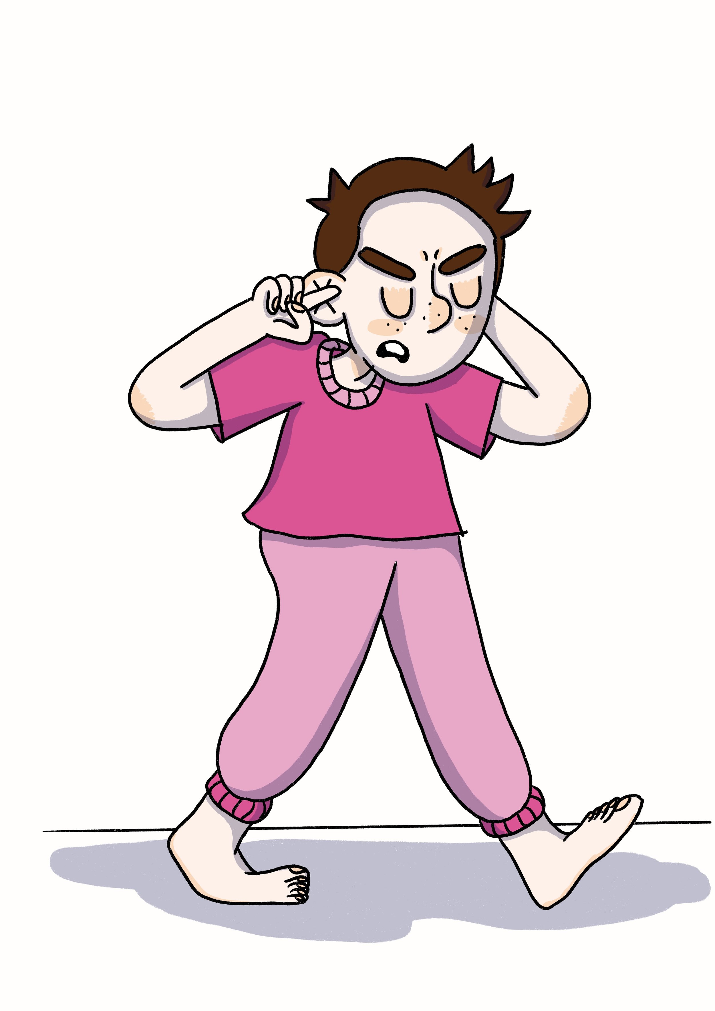
Four cartoon drawings of a young boy (my brother) from four different angles. He has his fingers in his ears and is wearing a pink tee shirt and pink track pants.

I’m deep into penciling my book at the moment, working hard to hit my publisher deadlines, but I thought I’d share a look at the prep work I do for a story. This is stuff I do before I start working on the thumbnails (roughly drawn comic script) and often even before I start working on the written script.

The first thing I do is, unsurprisingly, draw the main characters. The reason for this, of course, is so I have a reference to what the characters look like, so when drawing them repeatedly over the 250+ pages of story I can keep them consistent and easily recognisable for readers. But I have to admit I used to hate doing turnarounds (drawing your character from multiple angles) and would usually only draw a character once in one very straight, boring pose. Back in 2016, when I first started working on Oh Brother, this was what my main characters looked like:

Black and white drawing of four people. Mum (short, curly hair, teeshirt and jeans) is covered in paint and holding a paintbrush. Dad (short spiky hair, jeans and woollen jumper) is holding a laptop and a hammer. Rob (short straight hair, rugby knit top, shorts and bare feet) is holding a can of coke and a picture book. Gina (bob-length hair, jeans and sleeveless top) is holding a sketchbook and a satchel bag.

As you can see, my style has changed and refined itself a bit since 2016, although the main elements of the characters are still there. My brother and I were also adults in this version of Oh Brother (which was told from my adult perspective looking back at my childhood). The biggest shock to me is that I hadn’t started drawing crosses in people’s ears yet (which is now my ear squiggle of choice).

As the years went by, and many versions, edits and rough penciled comics later, the way I drew my family had changed, including drawing everyone younger because the book was now told from my childhood perspective (hence why Dad has a moustache in the picture below - he shaved it off by the time I was an adult). By 2020, I was working with my agent, Annabel Barker, to pitch my book to publishers. Here is the family redraw for the pitch:

Four cartoon images of a young family standing on brown carpet. Mum (in purple colours) and Dad (in blue colours) stand behind Rob (in a pink jumpsuit, fingers in his ears and chew toy at his belt) and Gina (in red colours and with a pink birthmark on one leg).

After Oh Brother was picked up by a publisher, it quickly became clear that I needed to revisit my character reference sheets for this new version of the book. Not only because how I drew had changed so much since starting the book in 2016 but also because I had added a whole new main character for this version of the book: Callie, Gina’s best friend.

Four cartoon drawings of a young girl (Callie, best friend) from four different angles. She is standing straight and has long brown hair and is wearing a green tee, blue jean shorts, gold sleeper earrings and white sneakers.

Callie is an amalgam of a few of my real-life friends and their experiences with Rob, so I was able to create an entirely new character design for her (although it is loosely based on a few friends). As the newest character, she has changed the most as I’ve worked on the thumbnails and pencils, purely because I’ve drawn her a lot less than the other characters. (But, to be honest, my style is wobbly at the best of times anyway, so there is always some healthy shapeshifting in my characters.)

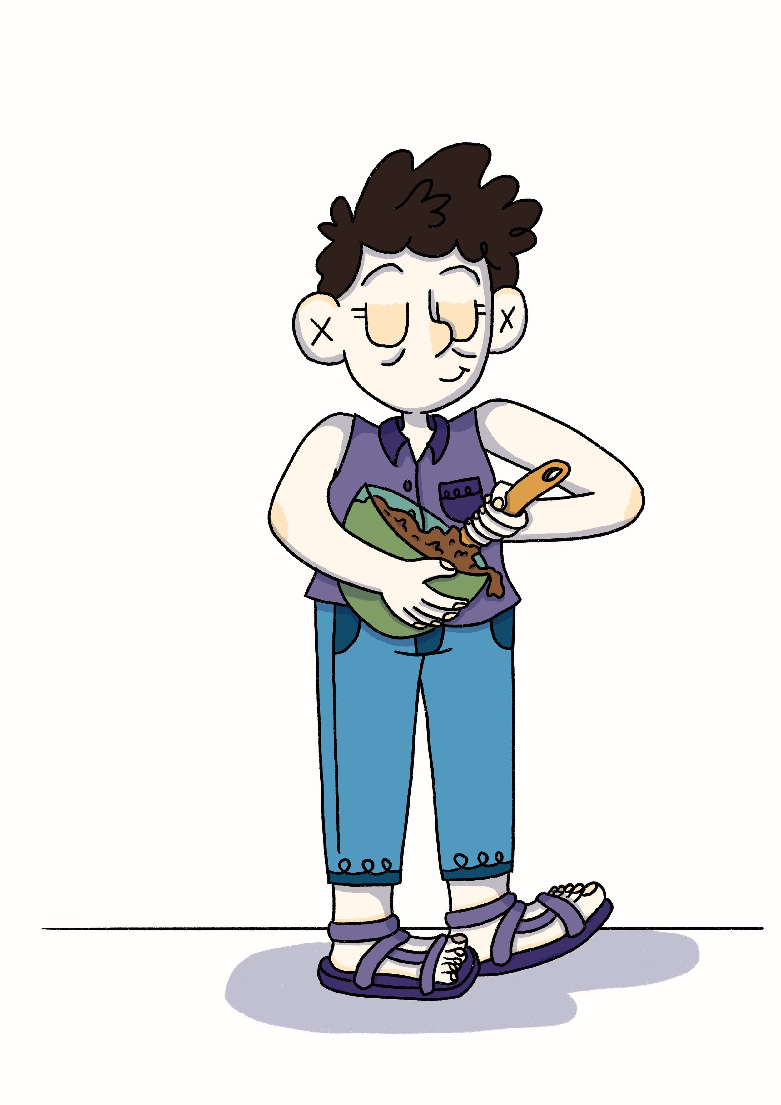
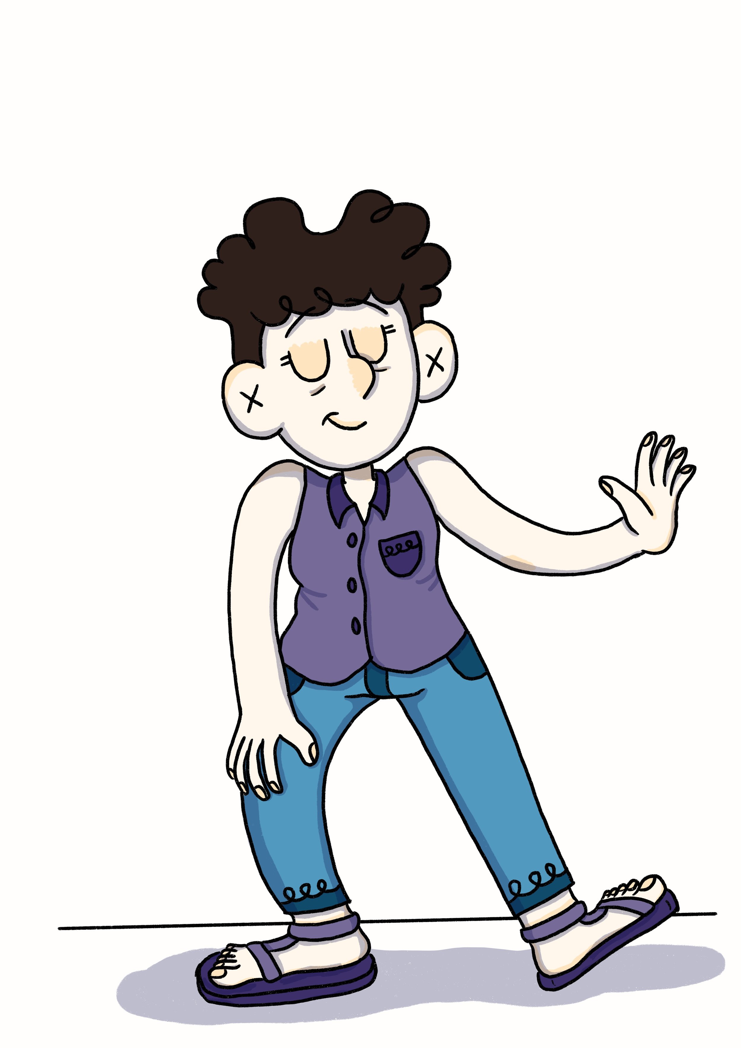
Four cartoon drawings of a woman (my mother) from four different angles. She is standing straight and is wearing a purple sleeveless top, blue jeans and purple sandals.

Speaking of shapeshifting, the character - or should I say element of a character - that I (still) find the hardest is my Mum’s hair. It doesn’t seem to matter how many times I draw it, its shape eludes me. This was also when I started confirming which colours I would associate with each character (again for ease of reading and knowing who is who).

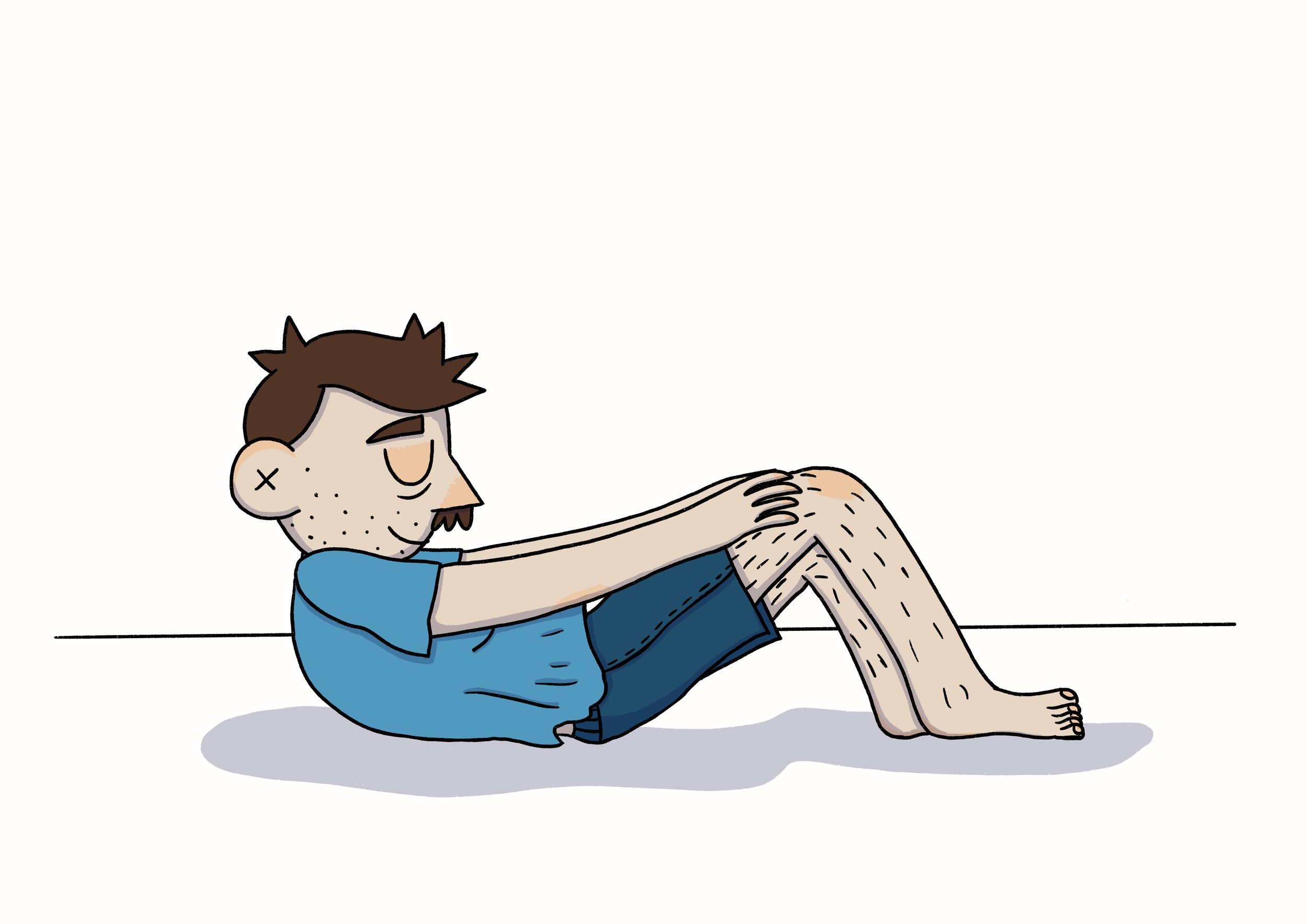
Four cartoon drawings of a man (my father) from four different angles. He standing straight and is wearing a blue tee with a high collar, blue jeans and and dorky white sneakers.

The character I found easiest to draw was my Dad. We look pretty similar (facially) in real life so when cartooning Dad I basically draw myself with a moustache and spiky hair. When I’m not paying attention, I draw my freckles on Dad instead of his stubble (and vice versa!).

Four cartoon drawings of a young boy (my brother) from four different angles. He has his fingers in his ears and is wearing a pink tee shirt and pink track pants.

I find Rob a fun character to draw but also really tricky. The way he holds himself (in real life he is constantly moving) is something that can be really hard to capture in still cartoon images. But it’s a fun challenge to try to get across his actions in the comics. For the new turnaround, I had to find a way to clearly show that he had his fingers in his ears from the different angles (which was harder than I thought it would be).

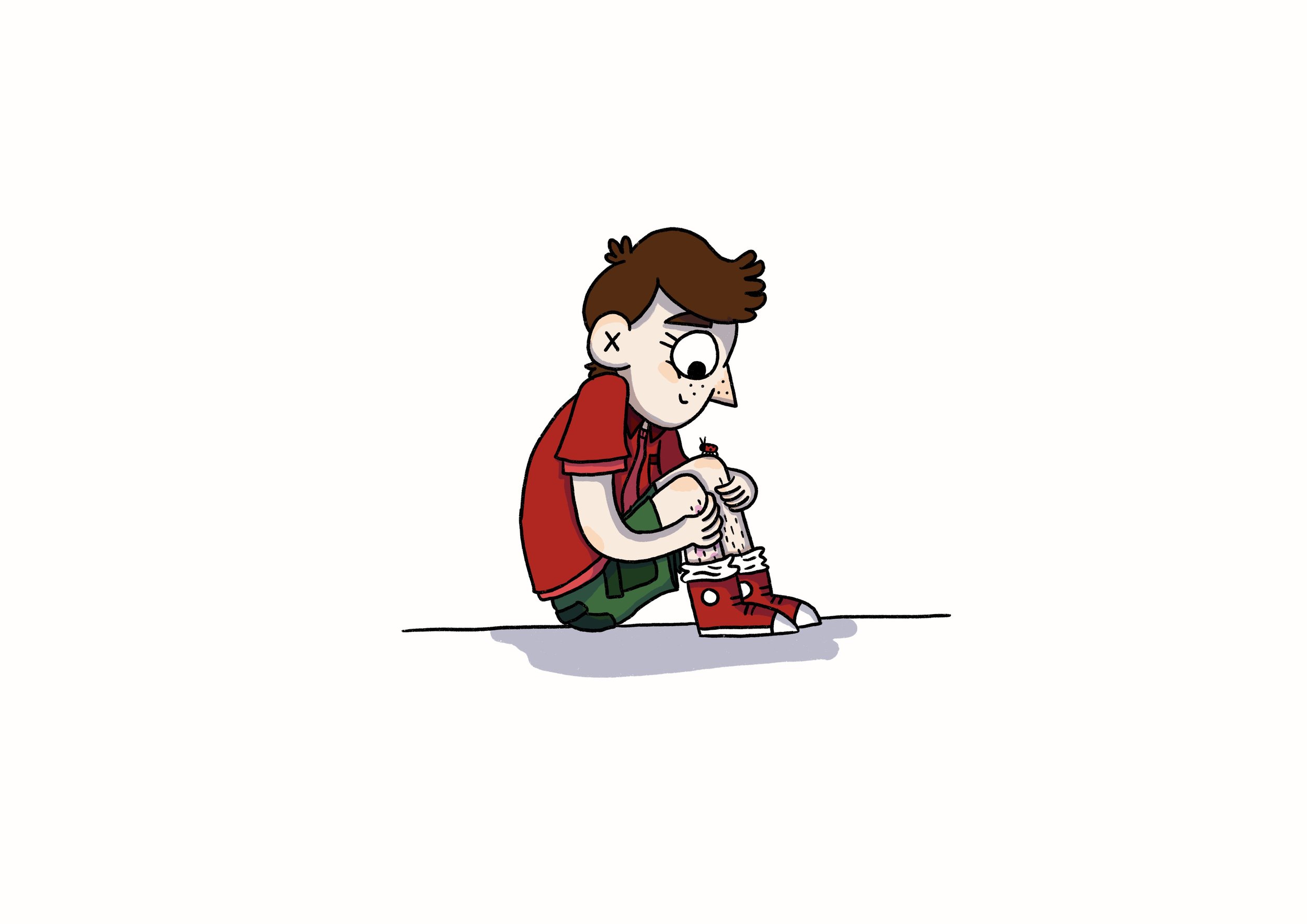
Four cartoon drawings of a young girl (me) from four different angles. She is standing straight(ish) and is wearing a red tee, blue jean shorts and and red sneakers. She has a pink birthmark on one of her unshaven legs.

By the time I decided to redo my character design sheets for this version of the book, I had gotten over my dislike of turnarounds and embraced them as a good way to get to know these new versions of the characters. I wanted to be able to draw more interesting angles and scenes in my book (and not just talking heads - which is my natural instinct), so I needed to know what my characters looked like from multiple angles.

But I didn’t stop at just turnarounds! In my next blog I’ll get ‘emotional’ and start playing around with drawing a full range of facial expressions for all of my characters.

Into the Comics Mines


An illustration of Gina holding an iPad, paper, pack of pretzels and a cup of tea and wearing a sash of pencils and a cap with a candle melted to the brim. Gina is looking unenthusiastically at a cave made from comics pages. The cave has signs stuck to it that read “Welcome to the comics mines”, “Danger RSI Ahead”, “Turn back and back up your harddrive” and “Beware of papercuts.”

Hello dear friends! This is it. I’m about to go into the comics mines for the next 6 months (approximately). What does this mean? It means that I will be working 5 days a week on the book with 1 day a week aside for admin & running workshops. Because of this fairly inflexible and tight work schedule, until the book is in the hot little hands of the publisher (approximately August) I will be taking a step back from posting online. This is to help me focus on getting pages done, as my brain starts fritzing out if I have too many projects to juggle, and social media posting in particular takes a lot of my brain energy powers.

📰BUT I will still be sending out my monthly e-newsletter to keep you updated on the book and share sneak peeks at anything else I can manage to squeeze into my spare time (I predict these things to be mostly sleeping, many cups of tea and watering the garden). I love sending out my newsletter and it makes me real happy when folks sign up - it’s the best way to let you know what I’ve been up to.