Meet Agatha


A blue monster with a triangle head, 3 eyes, 3 noses and 3 mouths. She is wearing a pink button up shirt tucked into yellow pants with a belt. She looks distressed by all the mess around her. She has three arms and three spiky tails holding cleaning equipment.

Hello Friends! This is Agatha. Agatha likes things to be just so. She very much believes in “a place for everything and everything in its place.” Agatha can sometimes get very stressed when things are messy and her friends don’t put things away where they should go but she also loves making things for friends. (Those who know me might see some resemblance between me at Agatha).

Agatha is another monster in Edith’s universe.

Meet Edith


A happy pink fluffy monster sitting in their bedroom under a tent made of patchwork blankets. The monster has big earmuffs on and rubbing a blanket on their face. They are surrounded by lots of lights and warm colours.

I know a lot of you already know Edith (who is the star of their very own eponymous mini-comic that you can read at my online clubhouse a.k.a website). Edith’s character is inspired by some of my own sensory needs (loves blankets and the quiet) and doesn’t always cope when they can’t get these things.

Edith came about as part of a monster workshop I ran a few years ago now (along with a few other monster pals I’ll be sharing here soon). I fell in love with them straight away and they’ve never left me. I keep doodling Edith in my sketchbooks and coming up with new stories for them (I’m hoping to eventually make a longer comic with Edith and their pals at some point).

Three Kids in a Trenchcoat


A pink background with a red ink drawing of three kids in a trenchcoat, hat, glasses and briefcase. The two kids inside the trench coat are passing candy to each other.

Here’s a little t-shirt design I made for the Comic Art Workshop 2023 fundraiser. I had a lot of fun drawing one of my favourite tropes, Three Kids in a Trenchcoat. I’m really loving the pink & red colour combo at the moment. I want all my clothes to be pink and red!

Ky & George


Cartoon Ky + George drawn like paper dolls on a digital sketchbook. They are surrounded by all their favourite stuff, snacks, bubble tea, hats, musical keyboard, sketchbook.

It was my good friend Ky’s birthday a few months ago and I created this silly little drawing of us inspired by one of our video call chats. We’ve been buddies since high school and I miss her terribly (as we’ve not lived in the same state or country for almost 10 years now). 

But Ky always knows how to cheer me up (as demonstrated by the mail I received recently from her, a lovely letter and some french language mini-comics from Canada (current residential location) including one by one of my fave indie artists Cathon. I’d never mentioned Cathon to Ky, she just knows what I would love instinctively. 😌

Ky and I are both pretty different but also oddly very similar. We have on more than one occasion turned up to events wearing the same thing (un-planned) a thing that still fills me joy thinking about. Our differences definitely bring out the best in me, encouraging and supporting me to do things I wouldn’t always do by myself.

Here’s to all the people in my life (and yours!) that are wonderful and supportive and just get me (or you!). You are all very lovely. 💕

Brains, am I right?


A borderless, un-pencilled, comic drawn in thick black pen on pink paper. The comic is of my brain and me talking. The brain is saying “You always make the wrong decisions! You are selfish! You are useless! You should work harder.” I grab the brain out of my head and say “Hey. It’s okay. You don’t have to be perfect. You are allowed to rest. Your productivity is not your worth.”

A little comic I noodled out of my noodle a few weeks back. I kept tossing up whether I should redraw it and make it a cleaner, tighter comic. At the moment I’ve decided not to.

Sending love and strength to all those who also struggle with confusing their productivity with their worth.

Knitting Spider


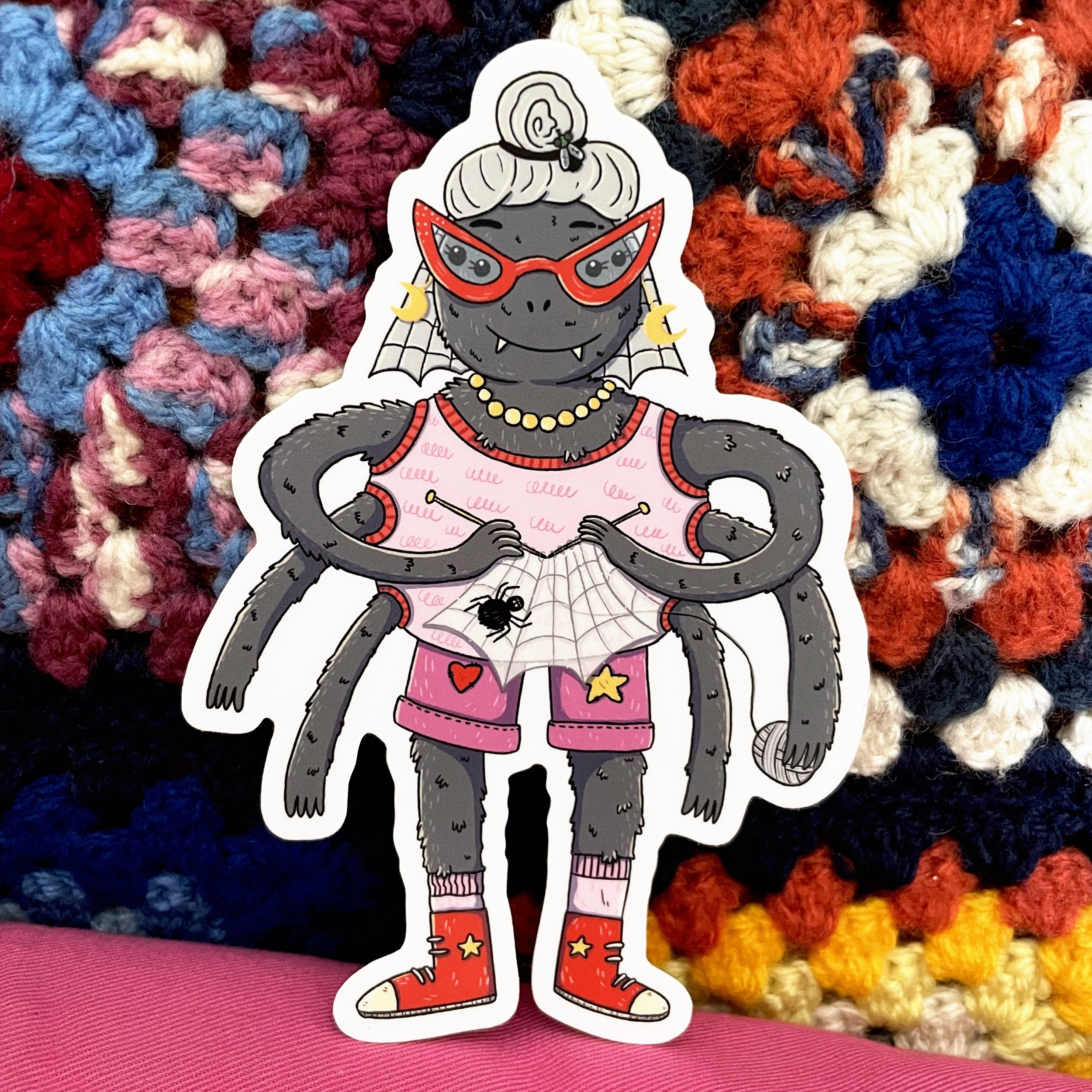
A cartoon illustration of a round grey spider knitting a web and wearing a pink tank top and shorts with a star and a heart patch sewn on. They are wearing red pointy glasses and red sneakers.

Here is my newest addition to my collection of George Rex ‘Cool Creatures’ Stickers. I’ll have the sticker version of this spider (along with all my other vinyl stickers) with me at the @papercutscomicsfestival market day next Sunday (in one week!).

Can’t make it to the festival? You can grab one from my online shop here.

Into the Comics Mines


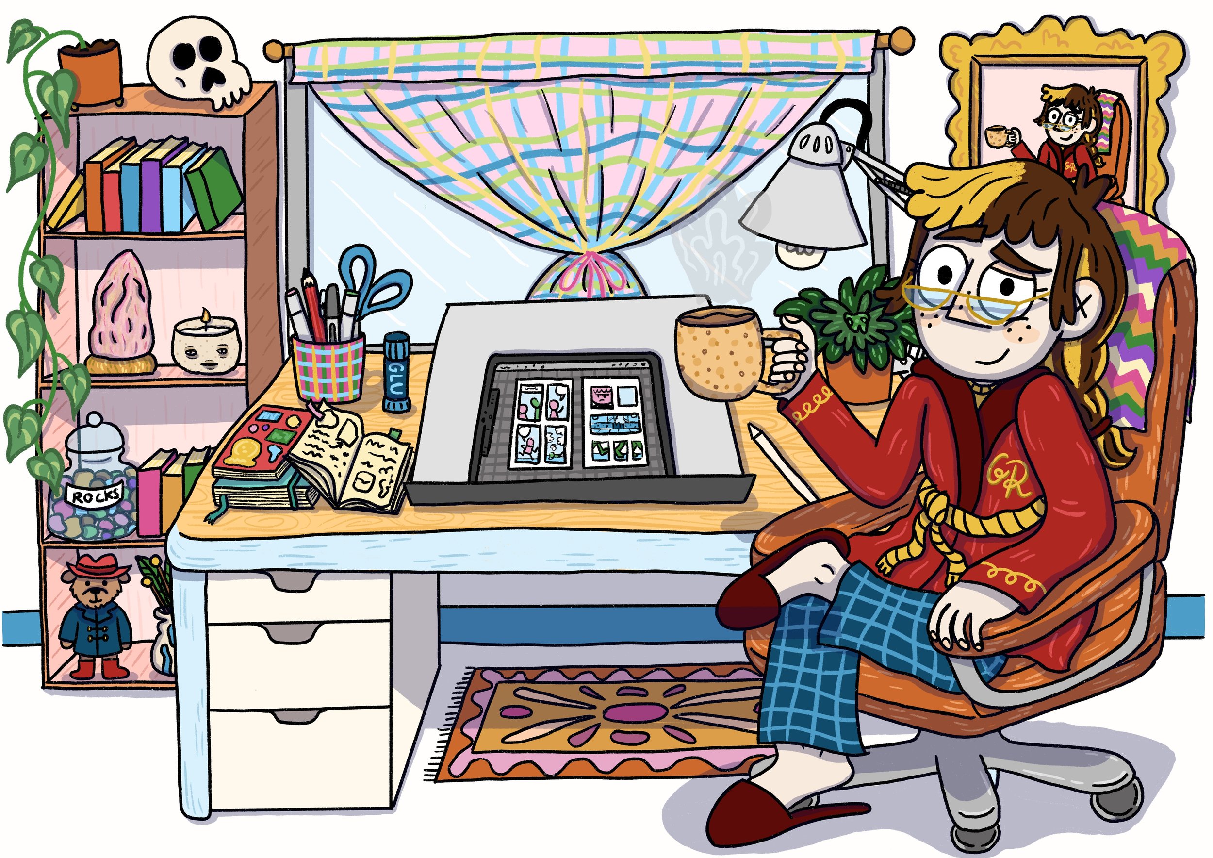
An illustration of Gina holding an iPad, paper, pack of pretzels and a cup of tea and wearing a sash of pencils and a cap with a candle melted to the brim. Gina is looking unenthusiastically at a cave made from comics pages. The cave has signs stuck to it that read “Welcome to the comics mines”, “Danger RSI Ahead”, “Turn back and back up your harddrive” and “Beware of papercuts.”

Hello dear friends! This is it. I’m about to go into the comics mines for the next 6 months (approximately). What does this mean? It means that I will be working 5 days a week on the book with 1 day a week aside for admin & running workshops. Because of this fairly inflexible and tight work schedule, until the book is in the hot little hands of the publisher (approximately August) I will be taking a step back from posting online. This is to help me focus on getting pages done, as my brain starts fritzing out if I have too many projects to juggle, and social media posting in particular takes a lot of my brain energy powers.

📰BUT I will still be sending out my monthly e-newsletter to keep you updated on the book and share sneak peeks at anything else I can manage to squeeze into my spare time (I predict these things to be mostly sleeping, many cups of tea and watering the garden). I love sending out my newsletter and it makes me real happy when folks sign up - it’s the best way to let you know what I’ve been up to.

Drawing Buddies - January Challenge


Above: Roof Rat by George Rex based on Jake Holmes’s Roof Rat.

Above left: Roof Rat by Jake Holmes. Based on the Highway Rat by Julia Donaldson, illustrated by Axel Scheffler.

Above right: The Highway Rat by Axel Scheffler.

This year my screenprinter & illustrator pal Jake Holmes (jaketoothandnail on instagram) and I have decided to be drawing buddies. Each month we will take turns to decide on a drawing challenge that we will both undertake over the course of the month. Jake already has his own goal of drawing for at least 30 minutes every day, which he’s been doing for the past couple of years, and I’m trying to do that too this year (that’s 30 minutes of ‘free’ drawing, on top of my Oh Brother work!). The monthly drawing challenges we come up with are more to help us have a guideline of something to draw, if we’re ever stuck for ideas. I’m hoping to use these drawing prompts to challenge my skills, particularly in areas that I’m weakest (perspective, adding backgrounds, light and shadow, pushing poses to be even more animated).

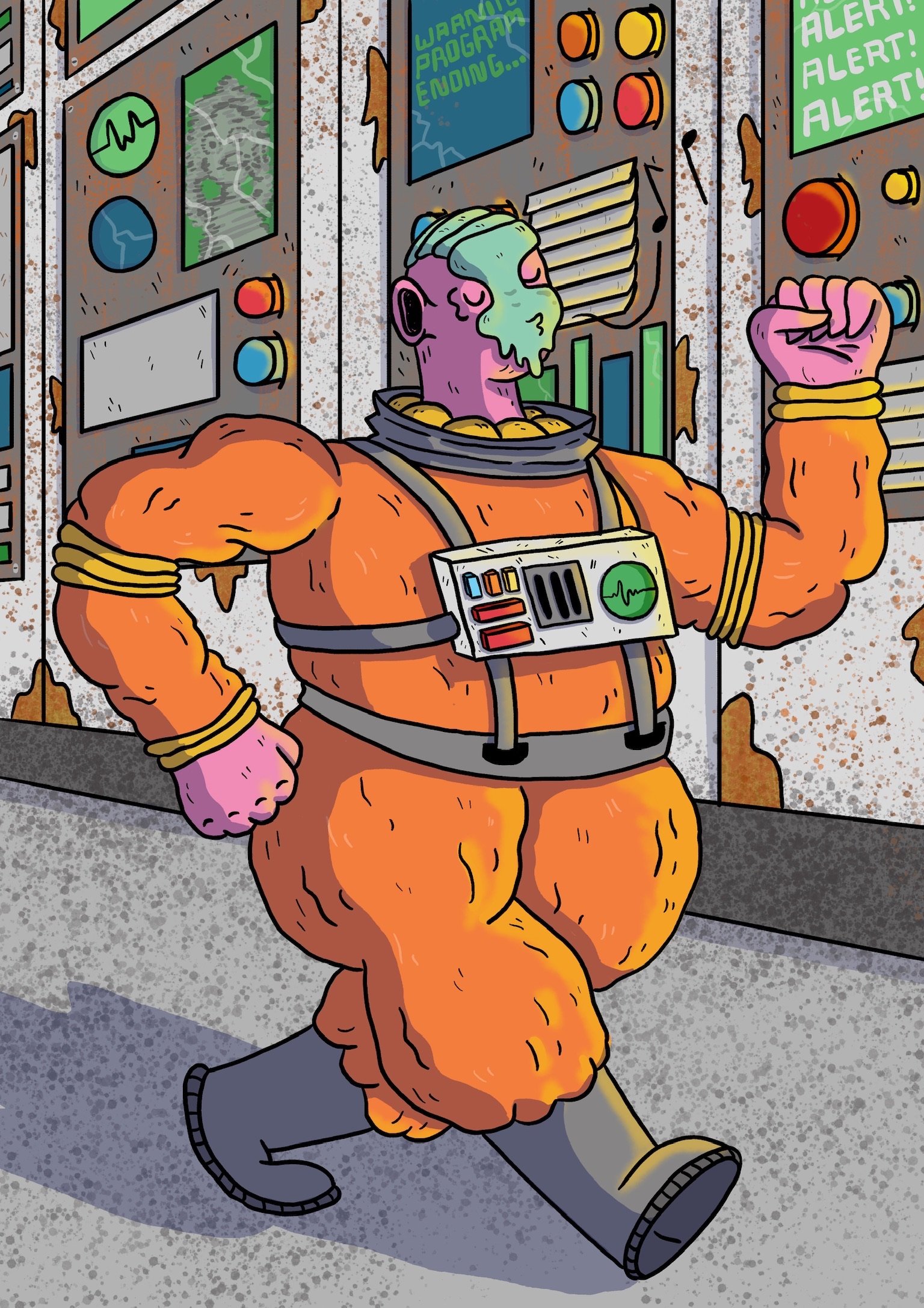
Above left: Jaunty Space Man by George Rex based on Jake Holmes’s illustration “Homecoming”.

Above right: Jake Holmes’s original illustration “Homecoming”.

The January challenge was set by Jake. It was simple: we scroll through each other’s instagram account, pick some characters that the other had already drawn & posted, and then redraw the characters in our own style. My aim was to do one a week throughout January. I tried to pick a range of different characters and then push their poses and add backgrounds (if they didn’t have them already).

Above left: Tina Papanikolas by George Rex, watercolour illustration.

Above right: Tina Papanikolas by Jake Holmes, based on watercolour illustration by George Rex.

Jake ended up drawing a version of one my favourite characters I’ve created in the past few years, Tina Papanikolas, who (along with her new best friend Tori) solves mysteries and crimes happening in their neighbourhood. I love Jake’s version of Tina, particularly how he captures her cool mesh skirt (I get to live out all my fashion dreams through Tina). My version of Tina that Jake based his off is one of the few watercolour illustrations I did last year, when I was trying to get a handle on different mediums.

I really like how Jake uses light and shade to bring his characters to life, and redrawing his characters this month has really pushed me to think about how I use light (or don’t) in my illustration and comics.

Above left: The Gang by George Rex based on Jake Holmes’s cool teens illustration.

Above right: Jake Holmes’s original illustration of three cool teens.

These Jake characters were the most like ones I would normally draw and I had a lot of fun trying to show their personalities through their poses. When I showed Jake my version, he said that he’d been inspired by how I draw characters when creating the original drawings. I thought that was pretty neat.

I had a ton of fun redrawing Jake’s characters and it was a great way to get into the habit of drawing every day, because I knew when I sat down to draw that I didn’t have to think about what to draw, I just had to have a quick scroll through Jake’s instagram and get inspired. So far this year I’ve managed to draw every day for at least half an hour and it feels really good!

Above left: Cheese Wizard by George Rex based on Jake Holmes’s Cheese Wizard illustration.

Above right: Cheese Wizard by Jake Holmes. Jake originally drew this character based on a prompt by me!

It’s been really interesting drawing so much that I notice little habits of mine, like how I generally love my pencil sketch but then hate the inked version (and the flat colours even more). But when I start adding in shading (and highlights) or textures, it all starts coming together. When it’s just inks and flats, it looks okay but it’s kinda like looking at a haircut halfway through, it’s almost there but it hasn’t got that pizzazz of a final drawing.

It’s my choice for our February drawing challenge but I haven’t decided what it will be yet. But I’m looking forward to it and seeing what we both come up with (it’s always more fun to do a drawing challenge with a buddy, it definitely helps to keep me more motivated).

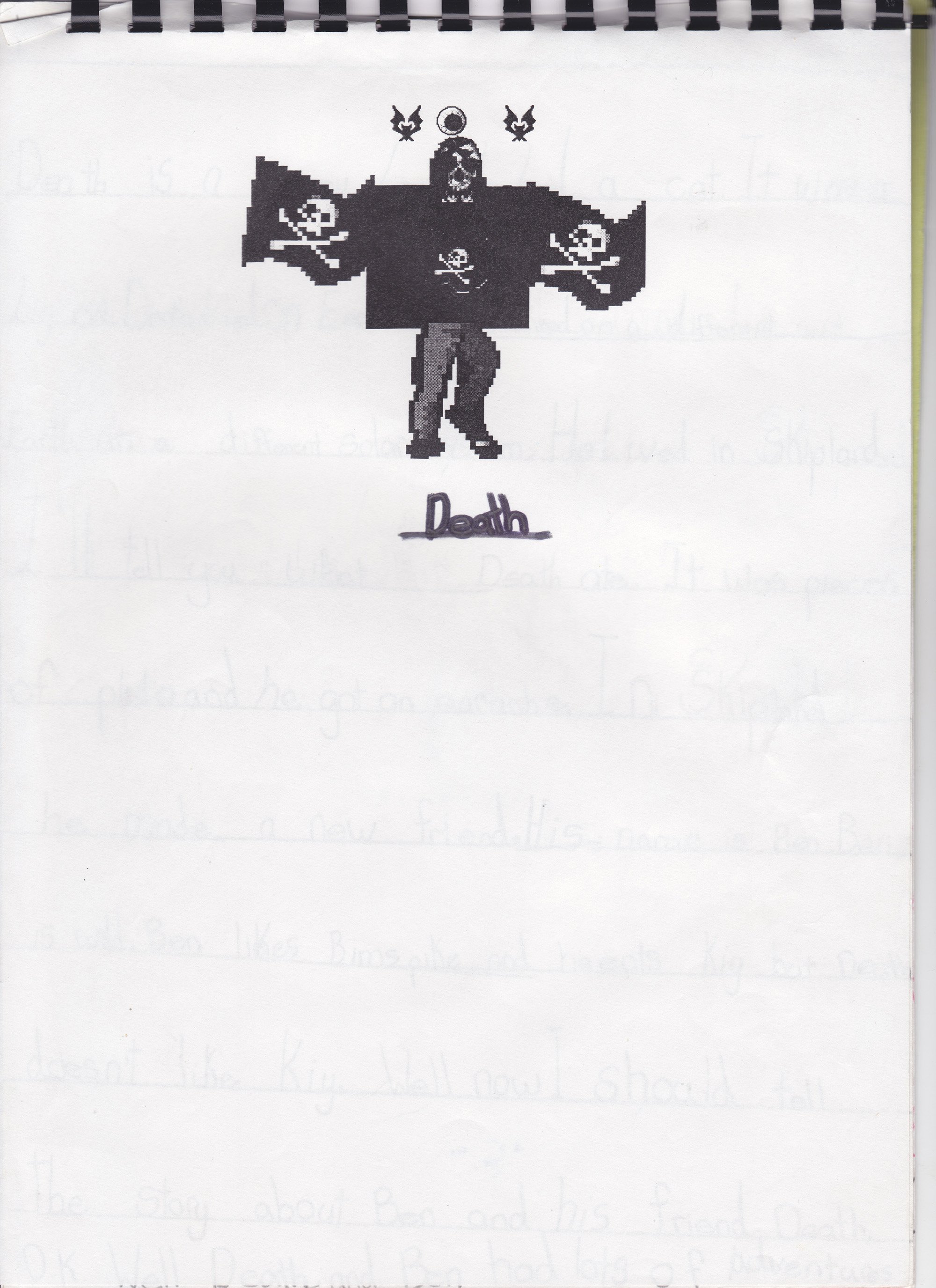
Death


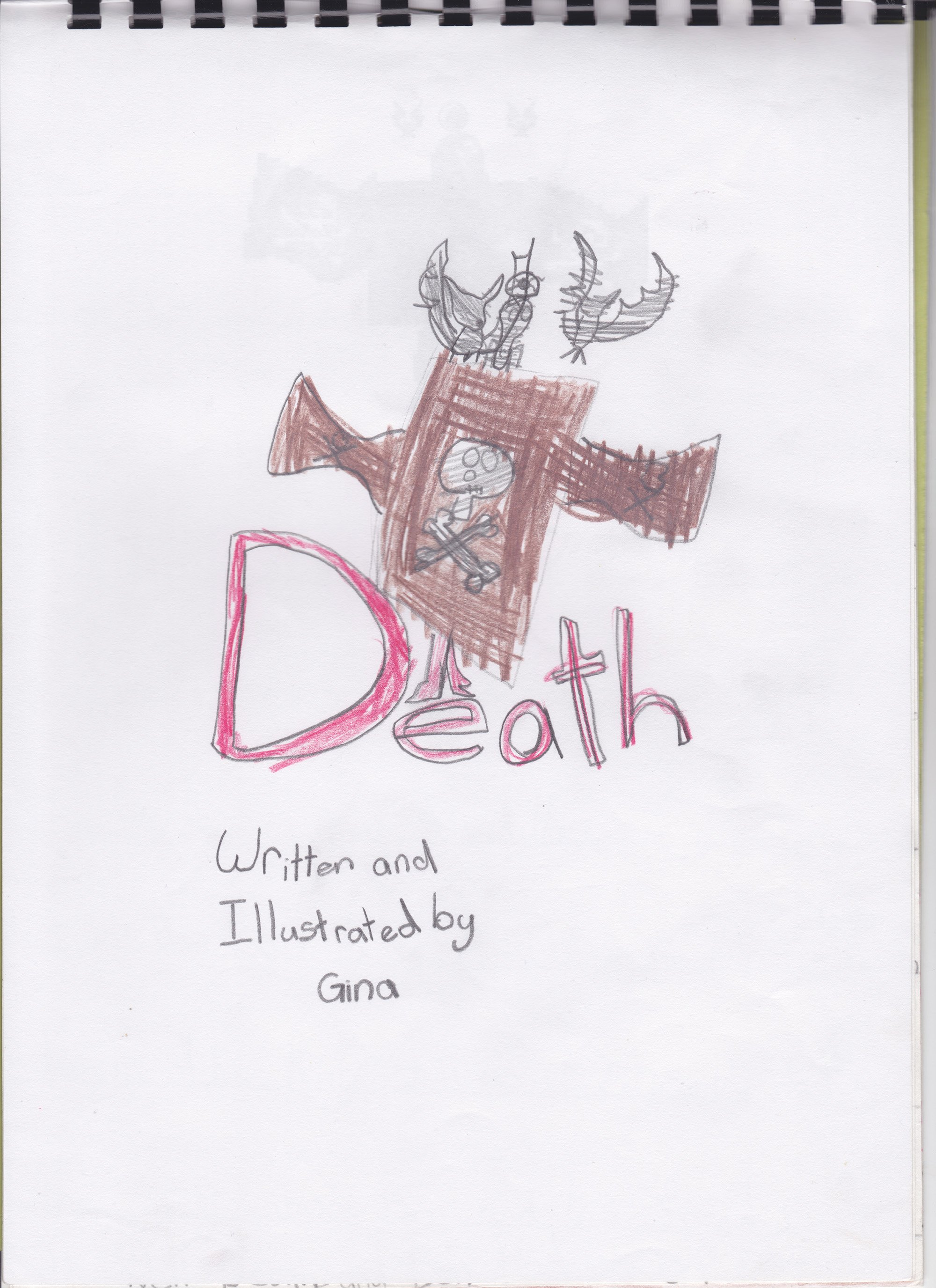
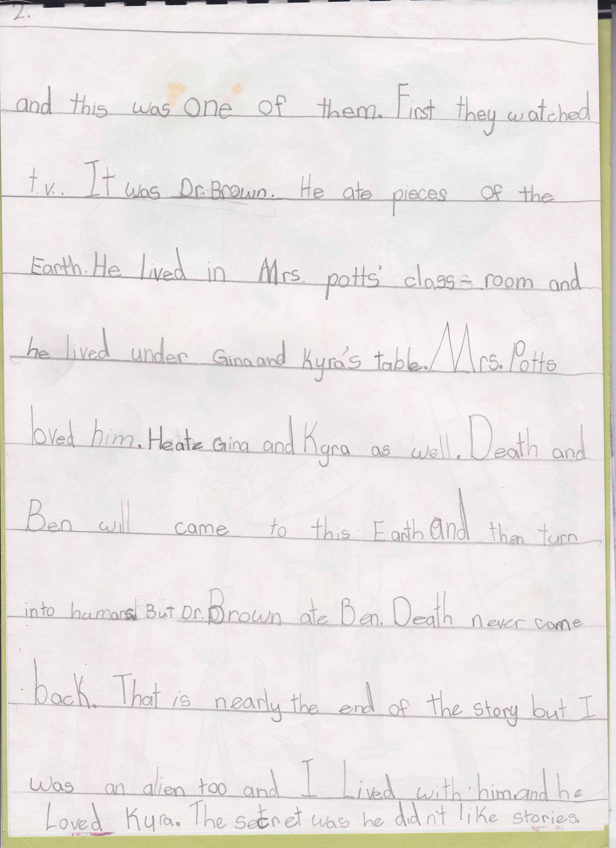
Here, for your reading enjoyment, is one of my early “published” works (from when I was 7). This was created for a school assignment. The idea was that we had to create a character using the ever-popular (at least while I was in primary school) computer art program called Kidpix (I really loved that program). I created a character called “Death” (I think my folks had just started reading Terry Pratchett books to me). This masterpiece includes some of my finest illustrative work (poo brown clouds with a variety of emotions) and features Kyra, who is still my friend to this day .

I’m impressed that I already had a grasp of what is “cool” (see: the sun wearing sunglasses).

Noodling around with ink wash


A while back I rediscovered a heap of ink wash pens I’d made back when I thought I would really get into using brushes and ink. I’d decided to start off with brush pens instead of jumping straight into using regular brushes (which seemed tricky and impossible, and still does a bit!). I took three refillable reservoir watercolour brush pens and filled each of them with varying ratios of ink. One pen was mostly water with just a bit of ink, another pen was 50/50 water/ink and the final pen was all ink.

Three brush pens with refillable reservoirs. Each pen has slightly darker ink than the one before.

I tried them out for a bit but at the time I don’t think I really liked the messy line I was making (after exclusively using fineliners my entire illustrative life) and couldn’t push through the uncomfortable perfectionist talk my brain was giving me, so I gave up on that inky brush dream. Recently, however, having used a bit more watercolour, I was curious about trying these out again, but treating them more like shading tools (and keeping those strong fineliner lines I feel confident with. Baby steps!). I mostly used the first two brush pens (the one that is mostly water and the 50/50 one). But I wanted to make sure that the scene I was drawing felt like it should be in B&W, so of course I landed with a fairy private detective in a film noir-style setting. Here are the steps I took to create this piece:

Step 1: Sketch it out

Using whatever scrap paper I had lying around, I sketched out the design loosely. As I wanted to practice my perspective (my nemesis) as well as using only shades of grey instead of colour, I had to draw this scene a few times to get it as close as I could to what I wanted. I was struggling to decide if I wanted it to be in isometric perspective or a more real perspective. I feel like I kinda landed somewhere in between.

Step 1: A rough pen sketch of a pixie sitting in a private detective’s office. The detective is a fairy.

Step 2: Pencil and Ink

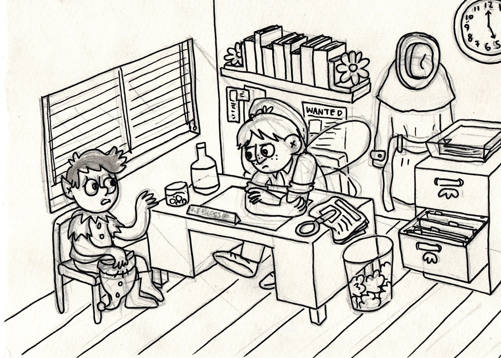
Now that I’d come up with a game plan, I popped over to our light table and, on a fresh piece of paper, pencilled out the scene again (using the sketch underneath for a guide). I then turned off the light table and inked the pencilled drawing. You can see where I’ve (not particularly successfully) tried to start marking in where I think the light might fall.

Step 2: A tight drawing of the pixie and the detective fairy. You can see some lead pencil marks under the clean simple inked line work.

Step 3: Final Inks and Ink Wash

I wasn’t super happy with how I inked the scene the first time, so I actually inked it again on a fresh piece of paper (getting out the light table again and using the pencil/inked drawing for the guide this time). If you look closely at Step 2 and 3 you can spot the minor differences in the line work (and some things that are missing!).

Once inked (with a fineliner), I erased the pencils and added in the shading with the ink wash brushes. As someone who generally just block colours everything, it was an interesting experience figuring out what to colour in and what to leave as a highlight.

Step 3: The same scene of the pixie and detective fairy but now it also has ink wash added to give depth, shading and indicate where the light source is coming from.

Although the line work is still a bit wonky, the perspective isn’t perfect and the lighting is…fine, I’m pretty happy with how this turned out in the end. I particularly loved the texture in the picture that came from using paper with more of a rough tooth (I usually use the smoothest of paper as I hate the feeling of my fineliners on a rough paper).

Anyway, that’s it! I really enjoyed working in greyscale and it really highlighted to me how little I know about shading and light. Lots to practice! I would love to do more ink wash and refine those skills for sure. Maybe I should make a whole comic about this fairy detective (or at least paint some keys scenes from a possible story a fairy detective might go through)?