Pencils Complete!


A blue line drawing of a slice of Vegemite toast on a plate and a bite taken out of the corner of it. ‘The End’ is written in the Vegemite.

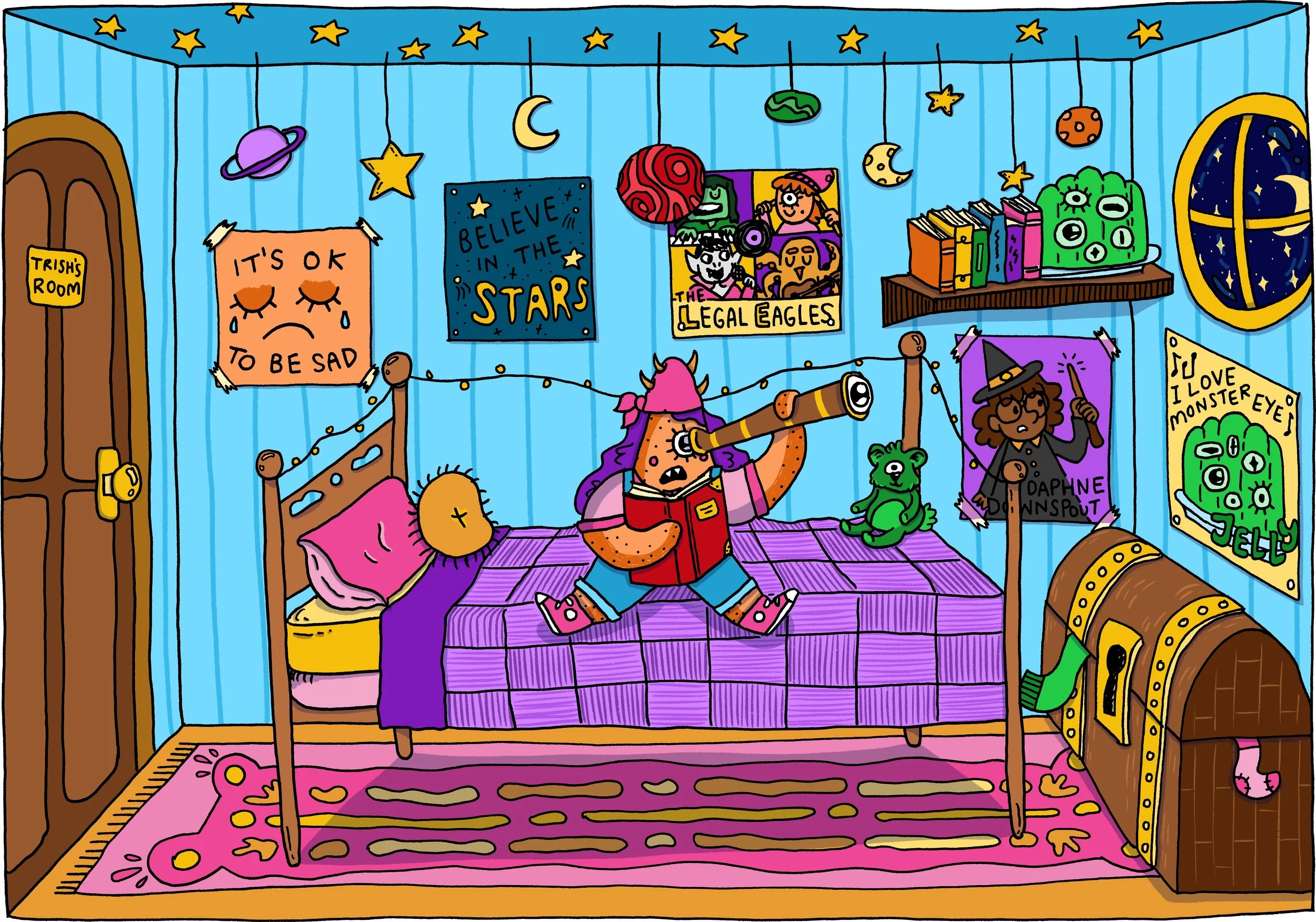
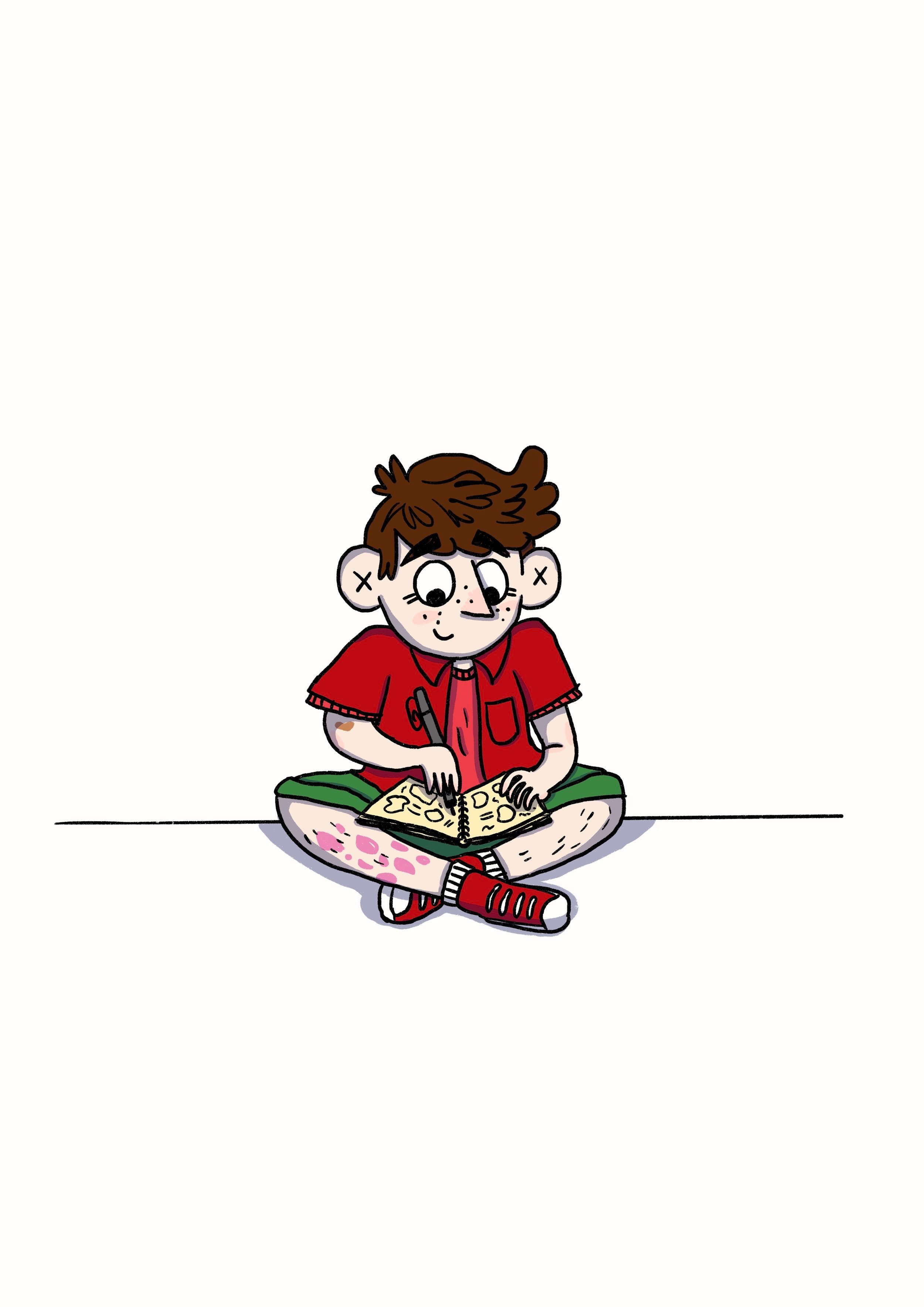
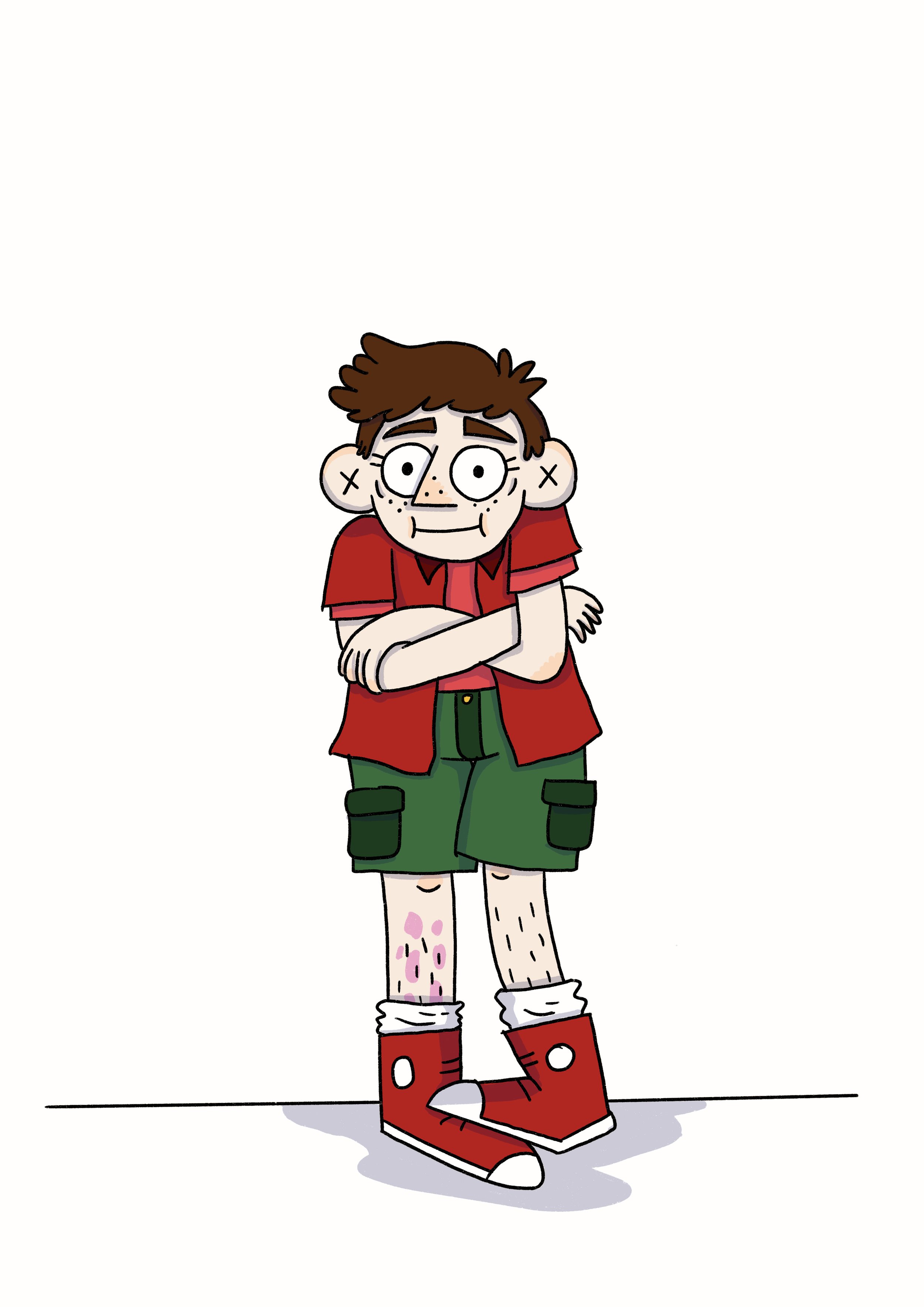
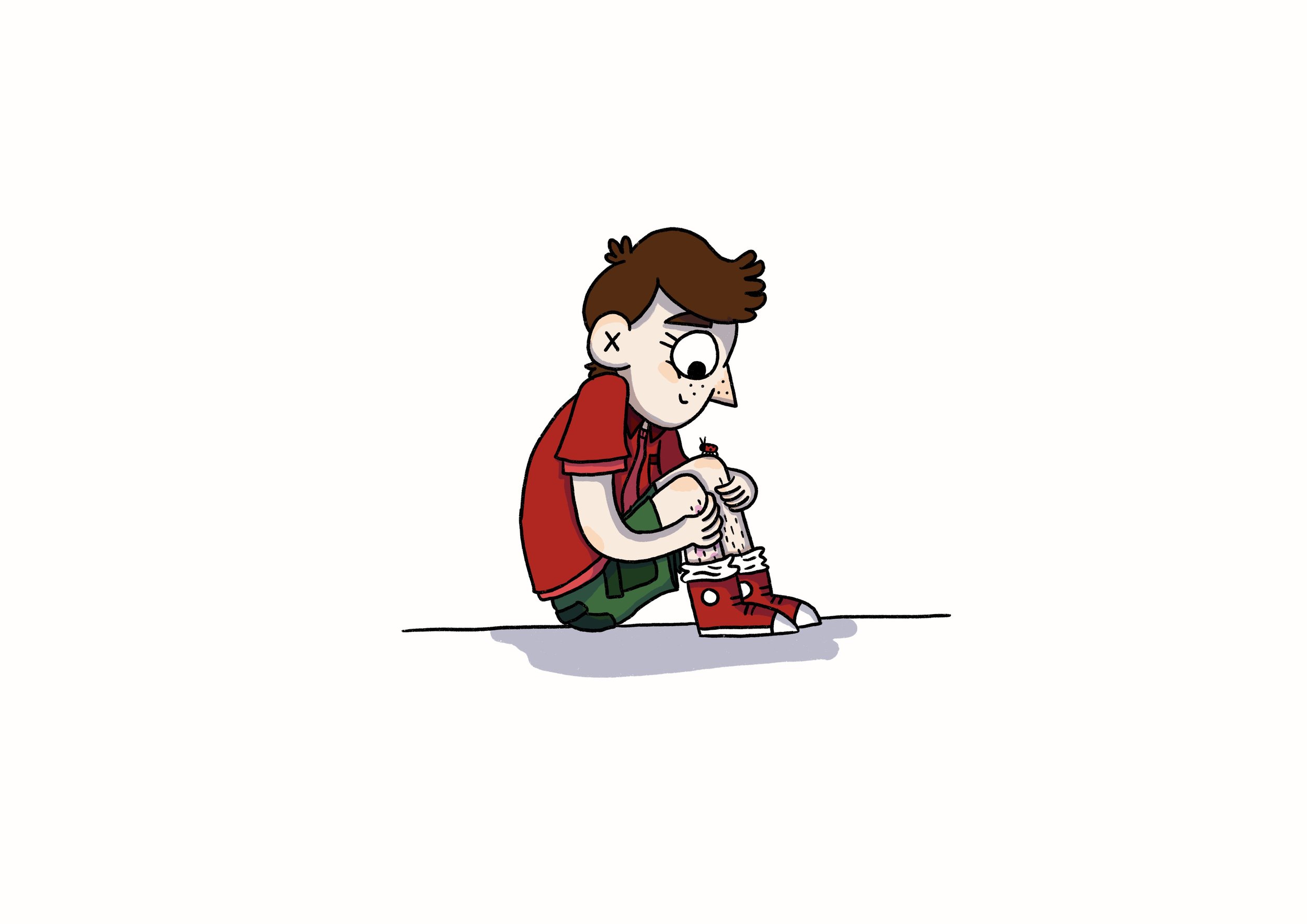
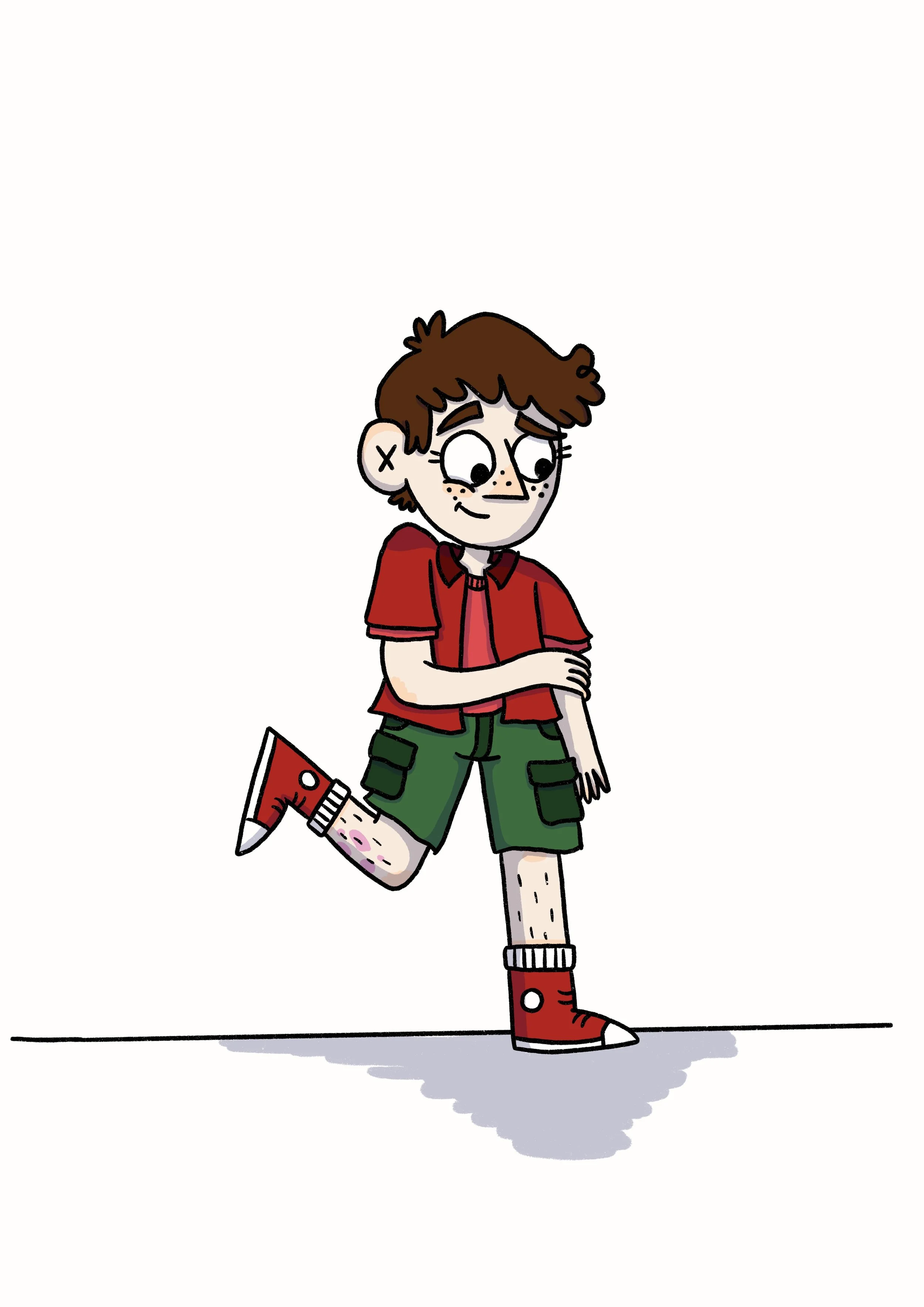
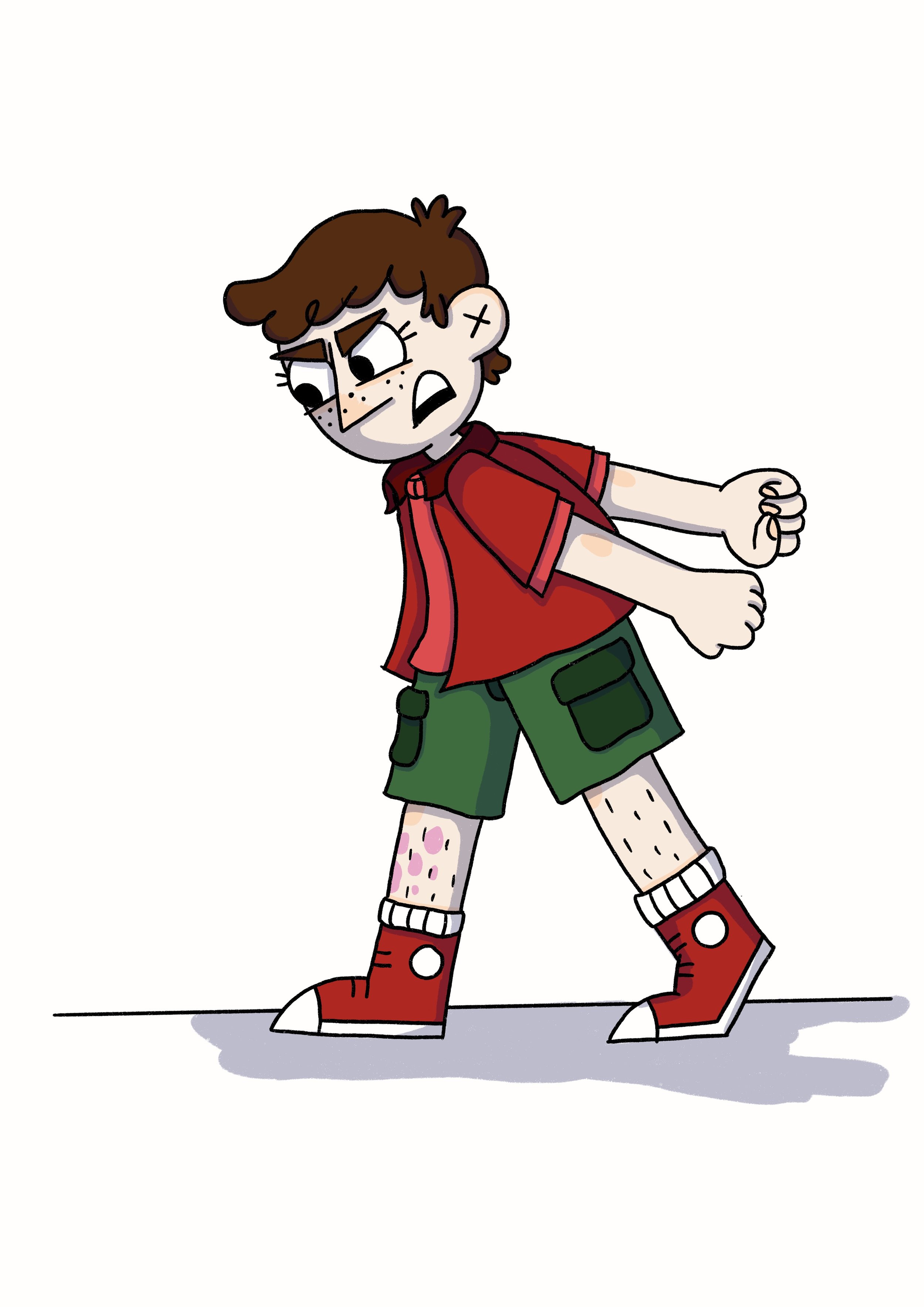
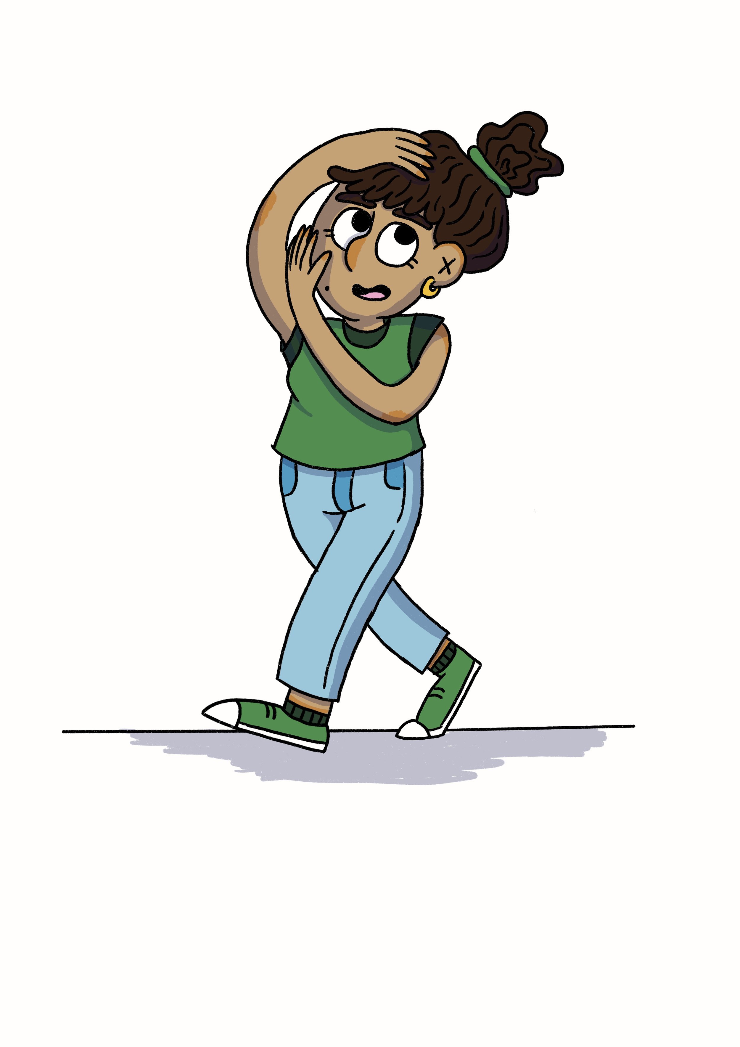
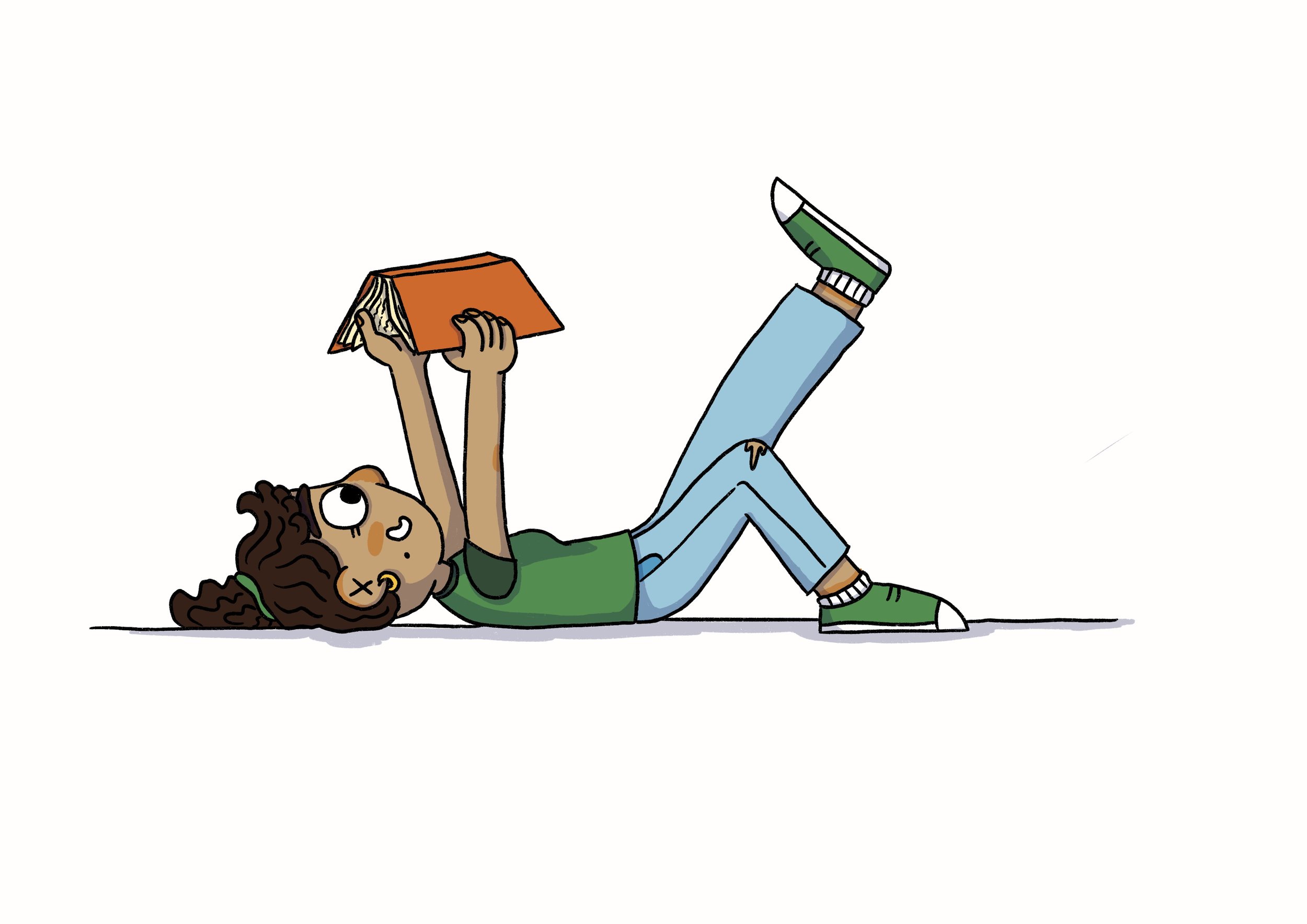
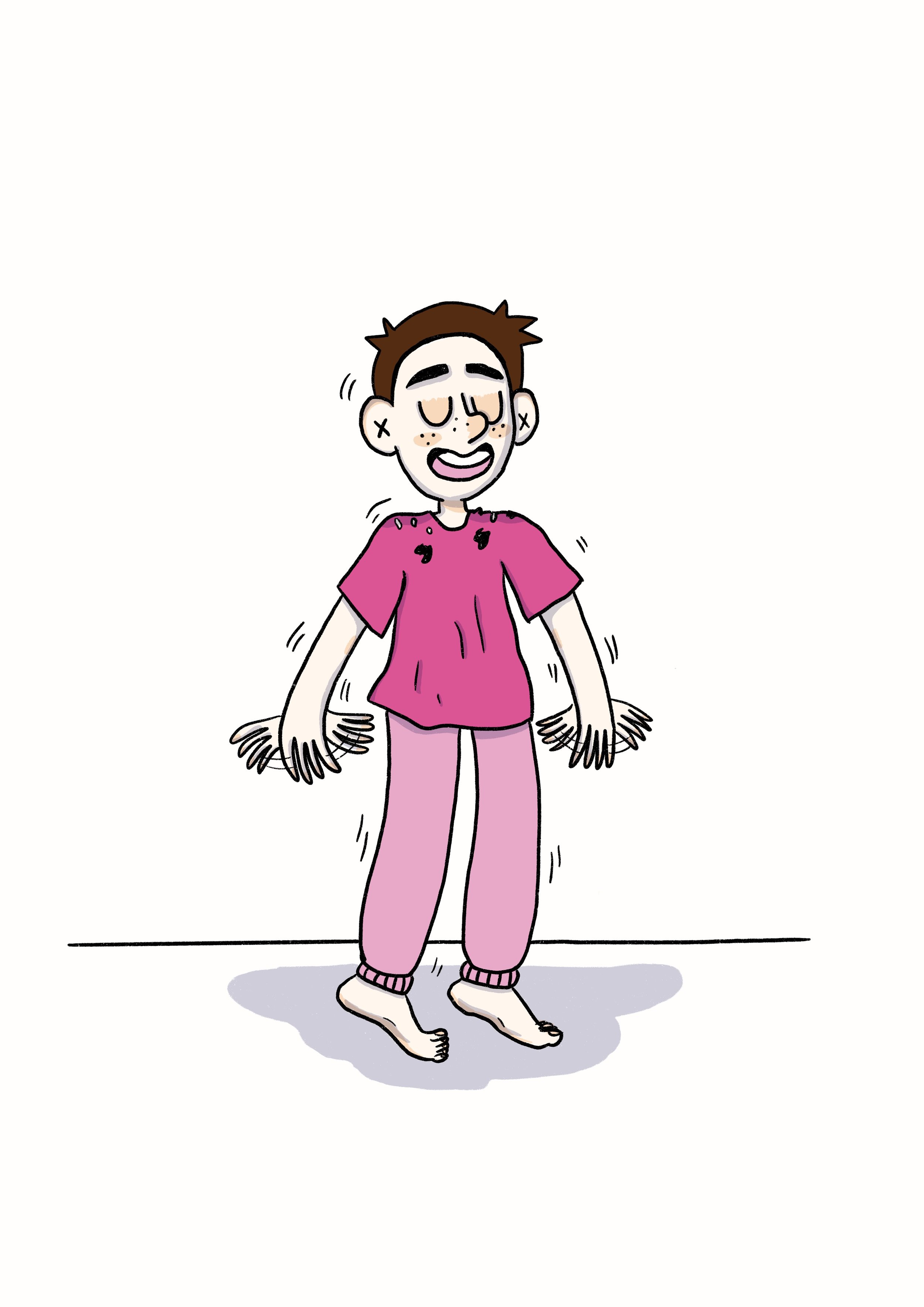
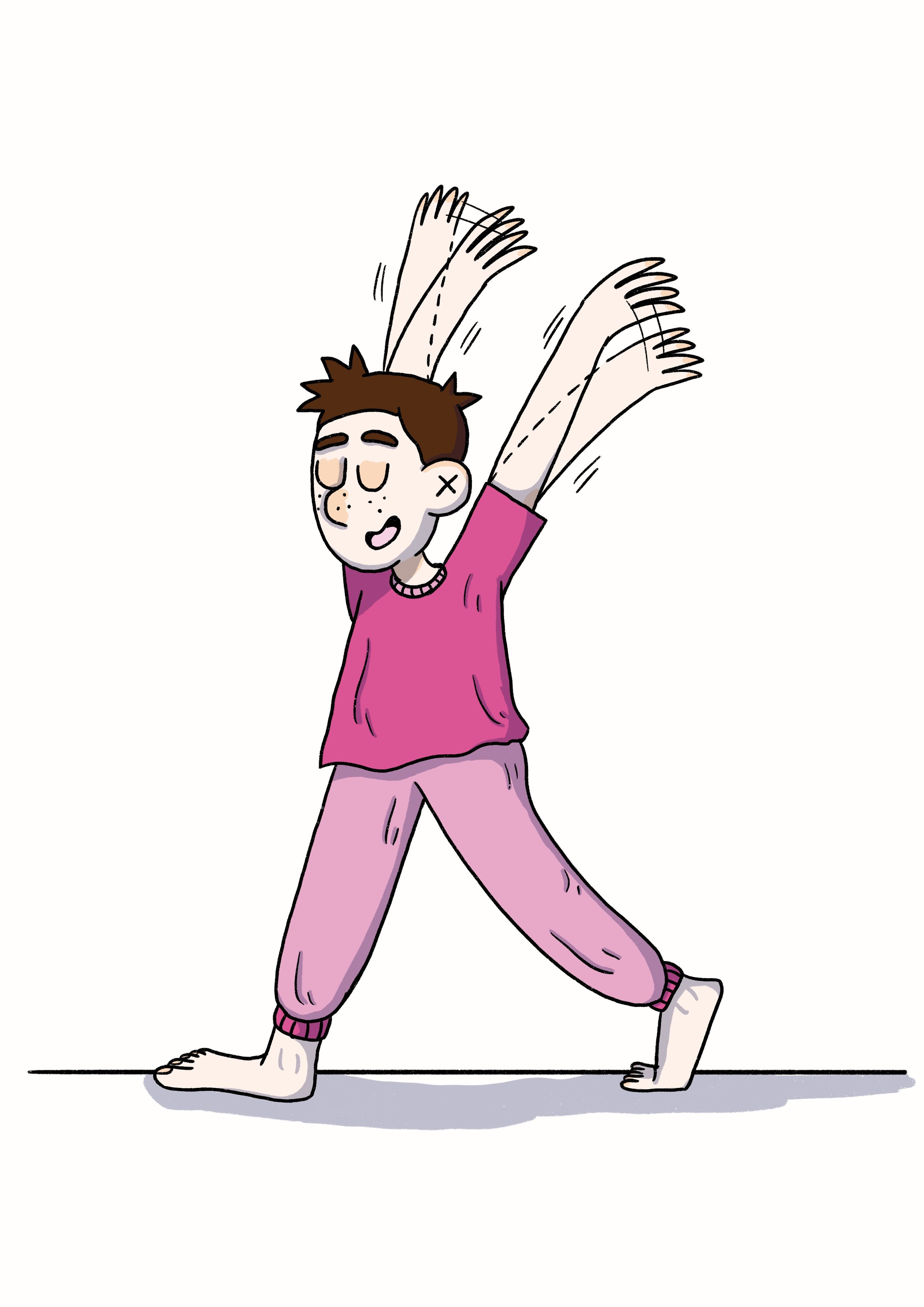
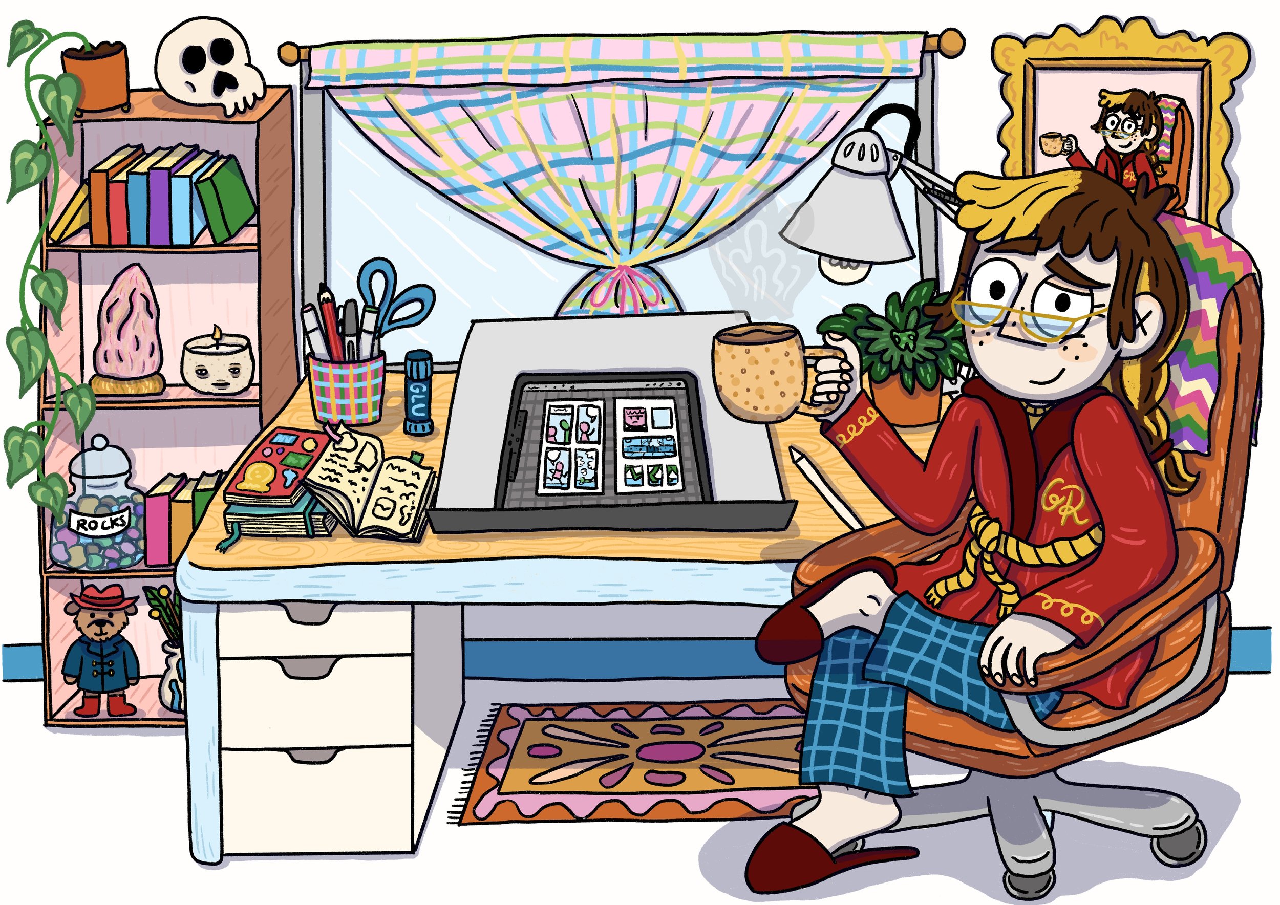
In very exciting news, I’ve just finished and sent in the pencils for the final chapter of my graphic novel, Oh Brother! This is by no means the end of the hard work (I’ve still got take on final edits and then ink & colour the book!) but it’s a huge step along the way to finishing and publishing my first graphic novel.

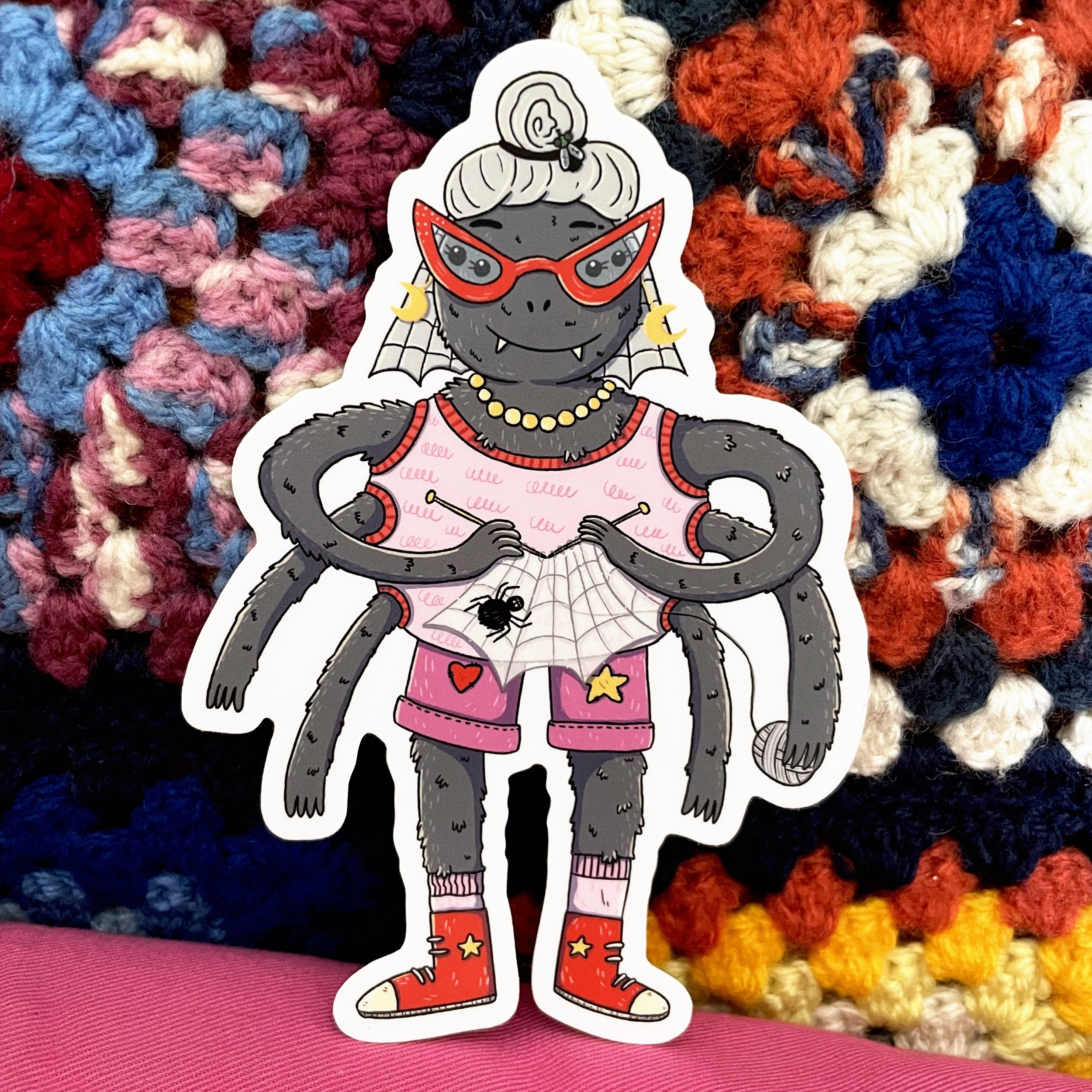
Because the book deadlines are super tight, I’m not going to be able to post too much here for next few months. So if you want to keep up to date with what I’m up to (and see more sneak peeks of the book), sign up to my newsletter (link in bio). I send out a little update at the end of each month with some behind the scenes looks at my work and links to any upcoming events I’m doing (pssst, I’m sending out my next newsletter tomorrow).

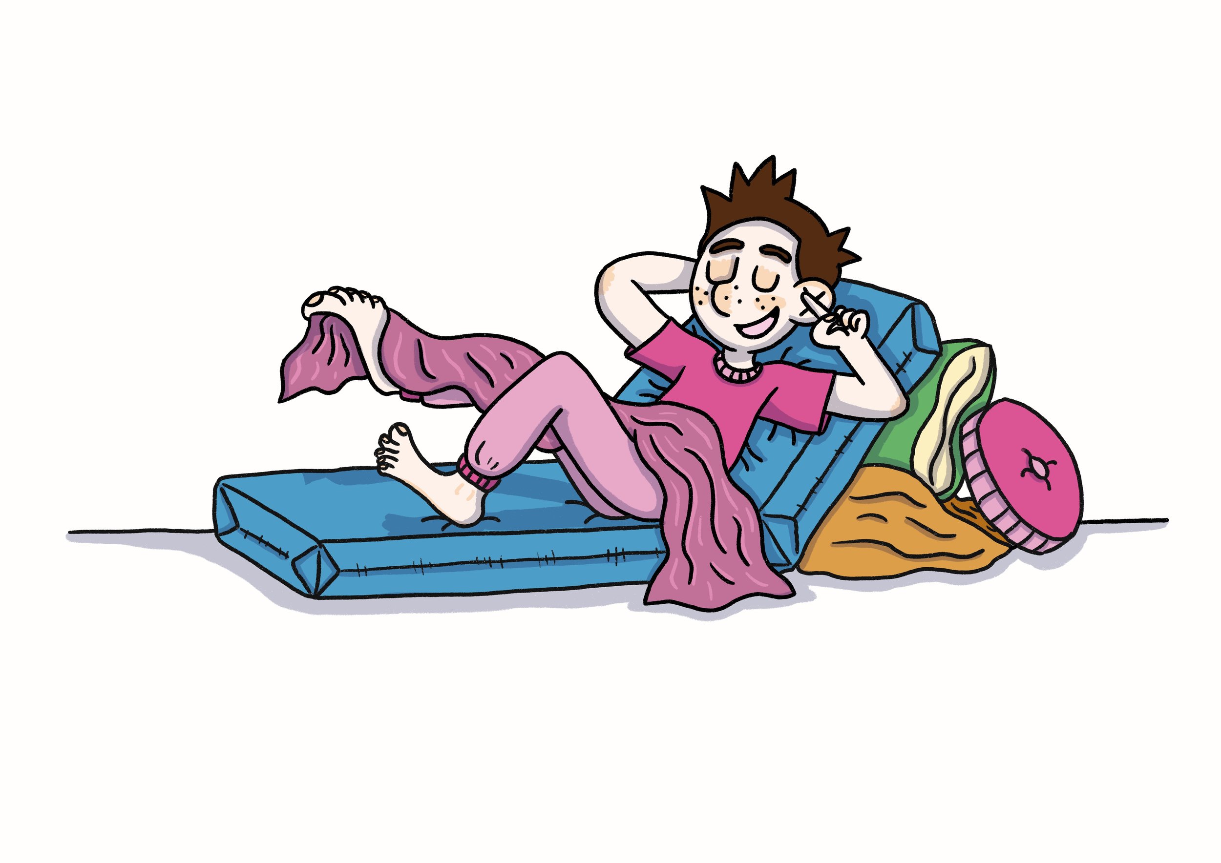
Alright, I’m going to go nap for a bit now so I’m refreshed and ready to start inking next week! 💪

Meet Trish


An orange starfish shaped monster with one eye is looking out at the night sky through an old telescope. They are wearing blue overalls and a pink shirt and look very worried.

And this is final friend, in our trio of monster pals, Trish. Trish is a worry wort and they are constantly worrying about their and their friend’s futures (and sometimes look to the stars for help). Their worry comes from a place of love, because they always want the best for their friends and they are very good at planning things. But Trish’s worry can also stop them from doing things they love (or at least making it far less enjoyable). I can’t *imagine* where I got the inspiration for Trish.

Meet Agatha


A blue monster with a triangle head, 3 eyes, 3 noses and 3 mouths. She is wearing a pink button up shirt tucked into yellow pants with a belt. She looks distressed by all the mess around her. She has three arms and three spiky tails holding cleaning equipment.

Hello Friends! This is Agatha. Agatha likes things to be just so. She very much believes in “a place for everything and everything in its place.” Agatha can sometimes get very stressed when things are messy and her friends don’t put things away where they should go but she also loves making things for friends. (Those who know me might see some resemblance between me at Agatha).

Agatha is another monster in Edith’s universe.

Meet Edith


A happy pink fluffy monster sitting in their bedroom under a tent made of patchwork blankets. The monster has big earmuffs on and rubbing a blanket on their face. They are surrounded by lots of lights and warm colours.

I know a lot of you already know Edith (who is the star of their very own eponymous mini-comic that you can read at my online clubhouse a.k.a website). Edith’s character is inspired by some of my own sensory needs (loves blankets and the quiet) and doesn’t always cope when they can’t get these things.

Edith came about as part of a monster workshop I ran a few years ago now (along with a few other monster pals I’ll be sharing here soon). I fell in love with them straight away and they’ve never left me. I keep doodling Edith in my sketchbooks and coming up with new stories for them (I’m hoping to eventually make a longer comic with Edith and their pals at some point).

Three Kids in a Trenchcoat


A pink background with a red ink drawing of three kids in a trenchcoat, hat, glasses and briefcase. The two kids inside the trench coat are passing candy to each other.

Here’s a little t-shirt design I made for the Comic Art Workshop 2023 fundraiser. I had a lot of fun drawing one of my favourite tropes, Three Kids in a Trenchcoat. I’m really loving the pink & red colour combo at the moment. I want all my clothes to be pink and red!

Ky & George


Cartoon Ky + George drawn like paper dolls on a digital sketchbook. They are surrounded by all their favourite stuff, snacks, bubble tea, hats, musical keyboard, sketchbook.

It was my good friend Ky’s birthday a few months ago and I created this silly little drawing of us inspired by one of our video call chats. We’ve been buddies since high school and I miss her terribly (as we’ve not lived in the same state or country for almost 10 years now). 

But Ky always knows how to cheer me up (as demonstrated by the mail I received recently from her, a lovely letter and some french language mini-comics from Canada (current residential location) including one by one of my fave indie artists Cathon. I’d never mentioned Cathon to Ky, she just knows what I would love instinctively. 😌

Ky and I are both pretty different but also oddly very similar. We have on more than one occasion turned up to events wearing the same thing (un-planned) a thing that still fills me joy thinking about. Our differences definitely bring out the best in me, encouraging and supporting me to do things I wouldn’t always do by myself.

Here’s to all the people in my life (and yours!) that are wonderful and supportive and just get me (or you!). You are all very lovely. 💕

Brains, am I right?


A borderless, un-pencilled, comic drawn in thick black pen on pink paper. The comic is of my brain and me talking. The brain is saying “You always make the wrong decisions! You are selfish! You are useless! You should work harder.” I grab the brain out of my head and say “Hey. It’s okay. You don’t have to be perfect. You are allowed to rest. Your productivity is not your worth.”

A little comic I noodled out of my noodle a few weeks back. I kept tossing up whether I should redraw it and make it a cleaner, tighter comic. At the moment I’ve decided not to.

Sending love and strength to all those who also struggle with confusing their productivity with their worth.

Knitting Spider


A cartoon illustration of a round grey spider knitting a web and wearing a pink tank top and shorts with a star and a heart patch sewn on. They are wearing red pointy glasses and red sneakers.

Here is my newest addition to my collection of George Rex ‘Cool Creatures’ Stickers. I’ll have the sticker version of this spider (along with all my other vinyl stickers) with me at the @papercutscomicsfestival market day next Sunday (in one week!).

Can’t make it to the festival? You can grab one from my online shop here.

Oh Brother Prep work, Part 3: Pushing Poses


A cartoon character holding up the peace sign with their fingers, leaning back on one bent leg and straightening out the other leg.

Following on from my previous posts about designing my characters and then practicing drawing their emotions, I had one final task: to practice drawing these characters in different poses!

My natural instinct is to draw all my characters in pretty much the same, boring, stock standard pose (standing straight with arms either hanging by their sides or in their pockets if I’m not feeling up to drawing hands). But after years of hanging out with animators, and seeing their excellently expressive and dynamically engaging character designs, something has finally started to rub off on me. I really wanted to be able to show more of the characters’ feelings through their body language (and not just their faces). So when I was practicing the new character designs for this rendition of Oh Brother, I tried my hand at pushing the poses of 5 main characters, starting with myself.

Gina - Pushing Poses

It was really hard for me to start pushing poses (as a naturally stiff pose drawer) but I loved seeing my characters become more loose and energetic the more I pushed the poses. I particularly enjoyed using this exaggerated body language to show the different personalities of the characters. My character’s poses are generally smaller and tighter as I’m a generally anxious and nervous human. In contrast, Callie’s poses (the friend character) are big and wide and open, because she is excited about lots of things and generally more open and welcoming.

CALLIE - PUSHING POSES

Pushing poses with my brother’s character had two extra drawing challenges: 1) He is constantly moving (whether it’s his arms or his legs, small movements and big movements, he never truly stops moving), and 2) He mostly went around barefoot when we were kids. I’ve done lots of playing around with ways to get across all of Rob’s different energies in the still image format of comics. And I’ve done my best to draw feet, which to me are like hands but much, much harder to draw (side note: I have never drawn so many feet in MY LIFE as I have with this book; I’d like to say that I’m getting better but…).

ROB - PUSHING POSES

I think my absolute favourite pose, of all the characters, is the one of my Dad wearing safety goggles and holding a drill in one hand and a hammer in the other. He just looks so silly (which is a side I don’t think people expect when they first meet him) but also focused and business-like (which I think is more a personality trait that people do associate with him).

MUM & DAD - PUSHING POSES

A resource that a friend recommended to me that was super useful was Sherm Cohen’s SpongeBob Drawing tips. It was a good visual reminder about just how far you can push a pose.


As this was new to me and my perfectionism can get in the way of doing new things, I found that it was useful to follow these loose steps when trying to draw pushing poses:

  1. Pick a character.

  2. Decide on a pose.

  3. Pencil it, without worrying if I was pushing the pose “correctly”, just draw like I would normally draw.

  4. Then I’d pencil it again but I would actively think about how I could pull or stretch certain parts of the pose. Can I make an arm higher or a leg longer? Should the body be straight up or can I bend in more?

  5. Finally, the fun part: ink and colour!

Practicing all these poses really highlighted to me that when I exaggerate body language, the characters somehow look more real and the emotions I want to convey to the reader are easier for them to understand. This is what I love about comics! I can show in a drawing how I feel much more clearly than when I use words to try and describe how I feel.

I’ve already started to see the difference in my characters’ poses (both for this graphic novel and other shorter comics & character illustrations). So I will keep practicing this and hopefully it will slowly start feeling more natural to me and I’ll be able to cut out step 3.

Oh Brother Prep work, Part 2: Getting Emotional


Following on from my last post about how the designs of the characters in my graphic novel, Oh Brother, have changed over the 7-ish years I’ve been working on the book, this post is about my absolute favourite thing: drawing emotions!

Once I’d settled on the redesigns, I wanted to make sure that I could draw these characters experiencing lots of different emotions but still remaining recognisable, even when their faces were squashed or stretched out of their neutral positions. Drawing emotions is something I’ve always enjoyed doing for some reason, maybe it’s the power behind capturing feelings or emotions (which I can find pretty hard to describe with words but much easier to capture with drawings).

I love making an emotion chart for my characters as it really helps me practice keeping the character consistent (something that I think is important for easy reading in comics: you don’t want to be questioning which character is which while trying to enjoy a story). Making these charts also means that I’ve drawn the character’s heads at least 20 more times before I even start on the book (and each time I draw them, it helps me to really settle on their character design).

Here are the character emotion charts I made for the main Oh Brother characters when I first started working on the book (2016) and last year (2022) before I started working on the thumbnails.

2016

2022

Originally my character was older in the book, so I had longer hair. In the new version I have my beautiful early teen hairstyle (short, not-as-cool-as-I-wanted pixie cut).

2016

2022

Rob, although technically older in the original version too, didn’t change as much in design. Although, being younger, I gave him a softer, rounder face and nose.

2016

2022

Mum’s hair has and always will remain elusive for me. I don’t think I’ll ever be able to draw it accurately. I claim that it has a life of its own.

2016

2022

Dad’s design remains similar (he’s still got that sandpaper stubble) but because the book is now set when we were all younger, I was able to pay homage to what I thought of as my father’s most defining facial feature, his moustache (something that he had for most of my childhood but has now been without for much longer).

The only character who doesn’t have an emotion chart to compare is Callie, who is a new addition to this version of the book. Since doing this emotion chart for her and working on the pencils, I’ve decided to not give her a fringe (but I’ve kept pretty much everything else the same).

I’ve always enjoyed cartooning (in comics and animation) because you can really push how you draw emotions to clearly showcase how a character might be feeling or thinking. I find it much easier to connect to these more exaggerated characters. I’m also the kind of person who practices pulling faces in every mirror or any reflective surface that comes my way (often practicing how my smile looks - so I know what my face feels like when my smile looks right and I haven’t got mirror in front of me to check).

I love these little emotion charts; I find them super helpful to refer back to as I’m working on a project. I would recommend making them for your characters too (even if you’re not working on a big project and it’s just for fun). But be warned: you may find yourself pulling the faces you’re trying to draw!